|
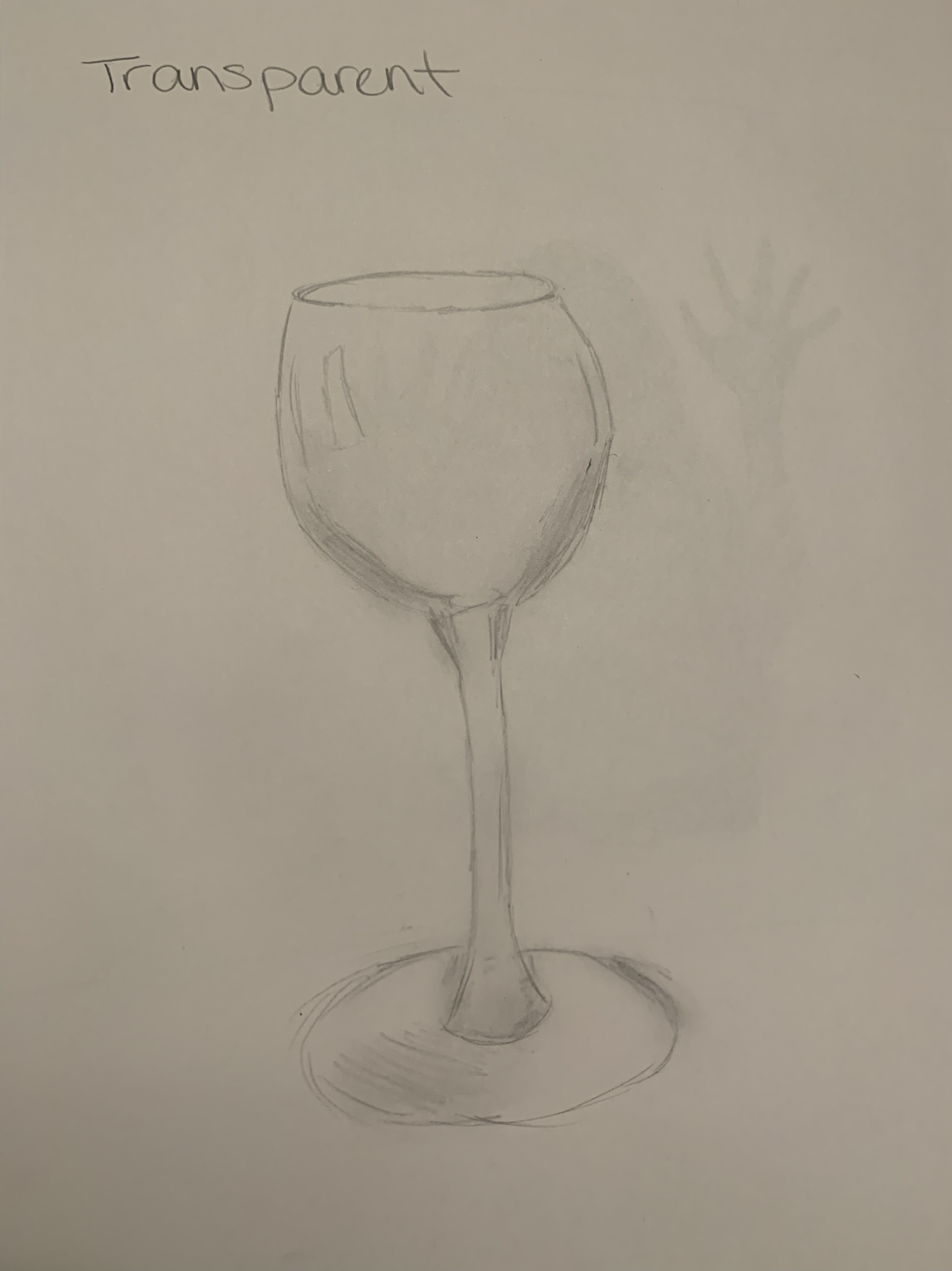
1. The first part of the art criticism process is describing what you see. Which means like what shapes and colors or even images you see in the artwork. The next part is analyzing the artwork. This is means to list the art elements and designs you see. Next. you interpret the artwork. This is your mood and ideas that are being told through the piece. Lastly, you judge the artwork(what do you think of it?). 2. 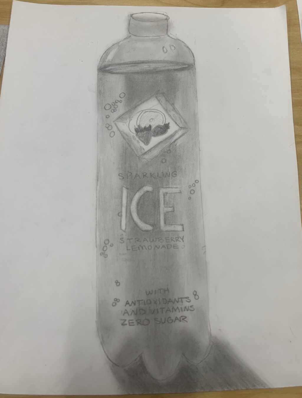 Describe: In my piece I see a large cylinder, that is the bottle in my piece. I see lots of words describing the drink in the bottle. I see lots of different shadings. Analyze: When I analyze my piece, the bottle looks nice and flat and shiny, especially since I added a little box of light reflecting off the bottle at the top. I used different values to make the piece look more 3 dimensional, like in the shadow and the middle of the bottle. I can see the contrast on the bottle that really highlights the details on my artwork. The colors are very grayed and calm in some spots. Interpret: When I interpret the piece I feel like the mood is very neutral. When I look at the art, I actually feel very calm and conservative. There’s not much of a story behind this piece, we were just assigned to draw an object from the room and I chose this bottle. Judge: I actually really liked this piece and I do think it is successful. I just feel like it looks pretty realistic and I added enough different tones to create a 3D piece. The only thing I would've worked on more was maybe the shadow, I feel like it just looks kinda sloppy, but other than that I do think it was successful. 8. I think some problems artist may encounter when planning or making art could be simple problems such as no time to paint or lack of money for supplies, rent, etc. Other issues that could occur could be lack of support from family or friends, or more emotional troubles like trying to create something beautiful despite their feelings they have or their own problems their going through. I feel like lots of artists sacrifice their "visions" for other people's wants, which may not be their own. Artists could lose motivation or they may not be getting any sales on their art. I think the biggest problem out of all these though that artists face is, having a negative attitude or not accepting their art because they think it's not good enough.  13. Honestly, the hardest thing about this class was coming up with an idea for any project. This is because I was trying to be creative and come up with original ideas, but sometimes it was hard. I think the biggest way I could of solved this was to try and let go of being afraid of not making my piece perfect. I think I was just more consumed with making a piece that was perfect, than just thinking of any cool ideas to make, no matter how crazy or dumb they seemed. I wouldn't know what looked cool or not unless I tried it.  16. If I could re do any piece, I would probably redo my mixed medium piece. The only reason I would redo it is because I want to add better mediums instead of like just doing it on a plain piece of paper. I even wish I just made the piece like more 3D and incorporated my theme more into it. My theme was exercise, and I just feel like I could of done more with it, for example I could of added like different balls used in sports to the piece and create sorta like a border. Other than that, I don't think my piece was that bad, except also maybe just choose a different color scheme, I feel it didn't look as good as I thought. 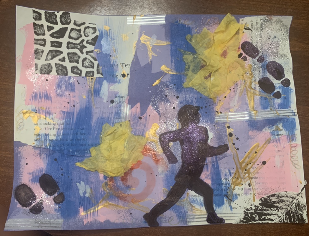
0 Comments
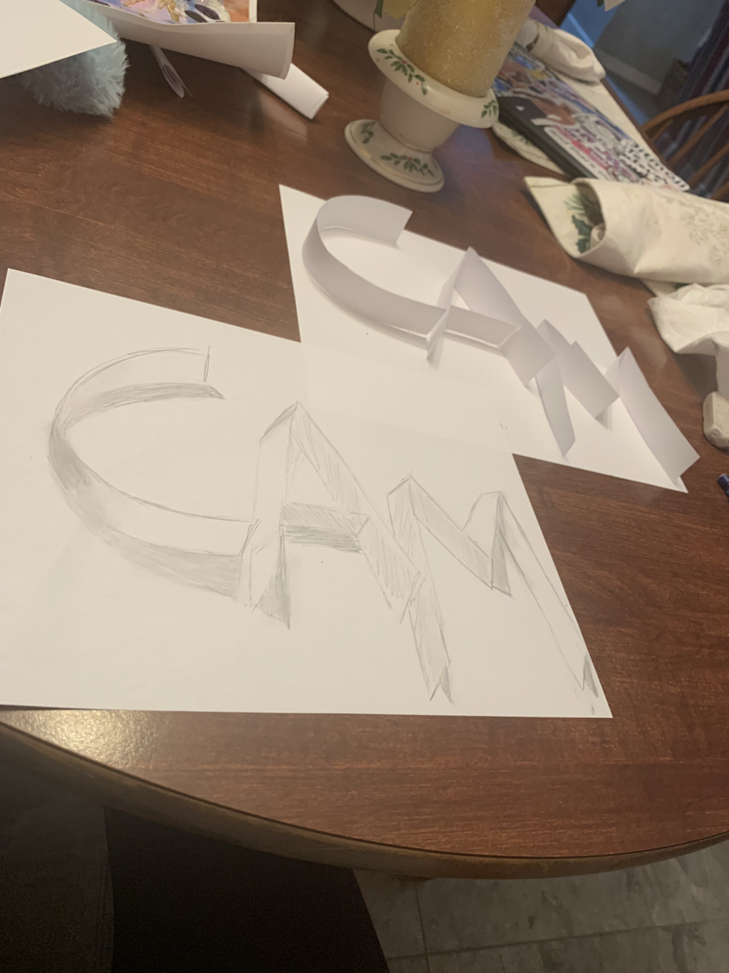
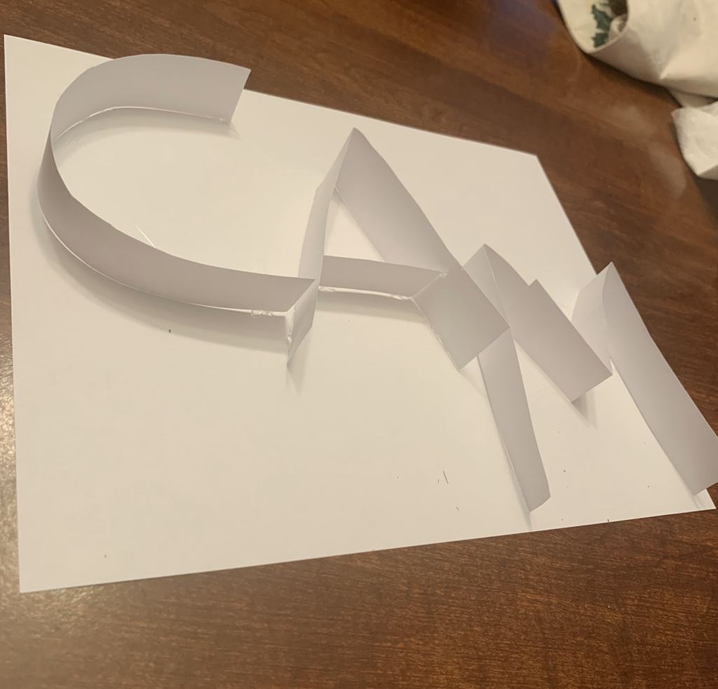
The Process: I first drew the letters normal, like 2D. Next, I made all the letters bubble letters and I then gently traced where the shadows were based on the picture. Lastly, I filled in the shadows and I took a napkin, so I could smudge the shadows and make them more pronounced. Warm ups:
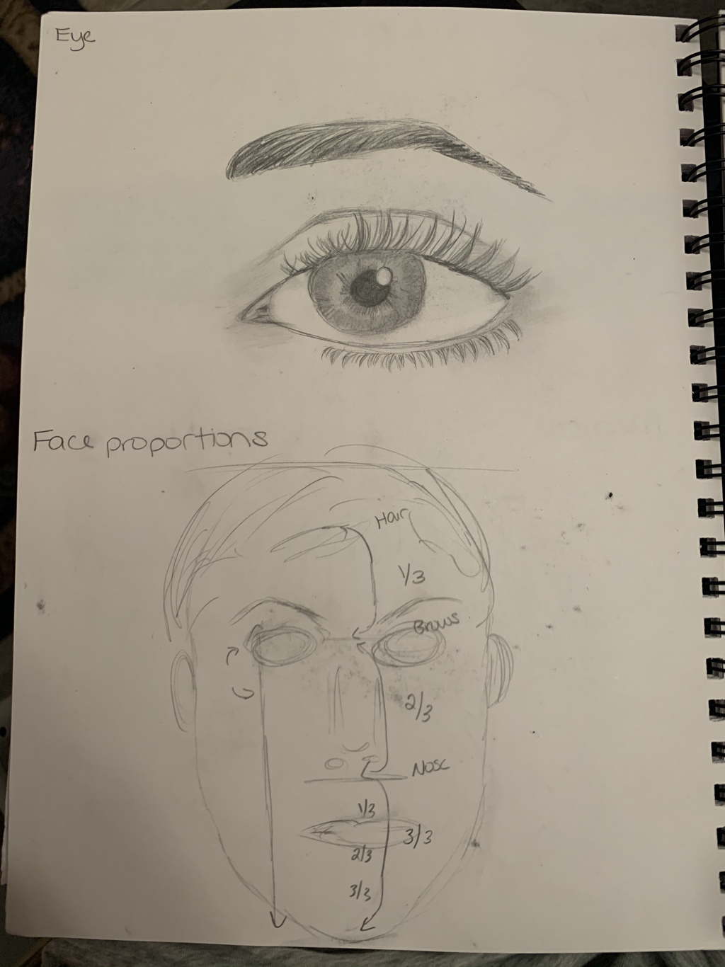
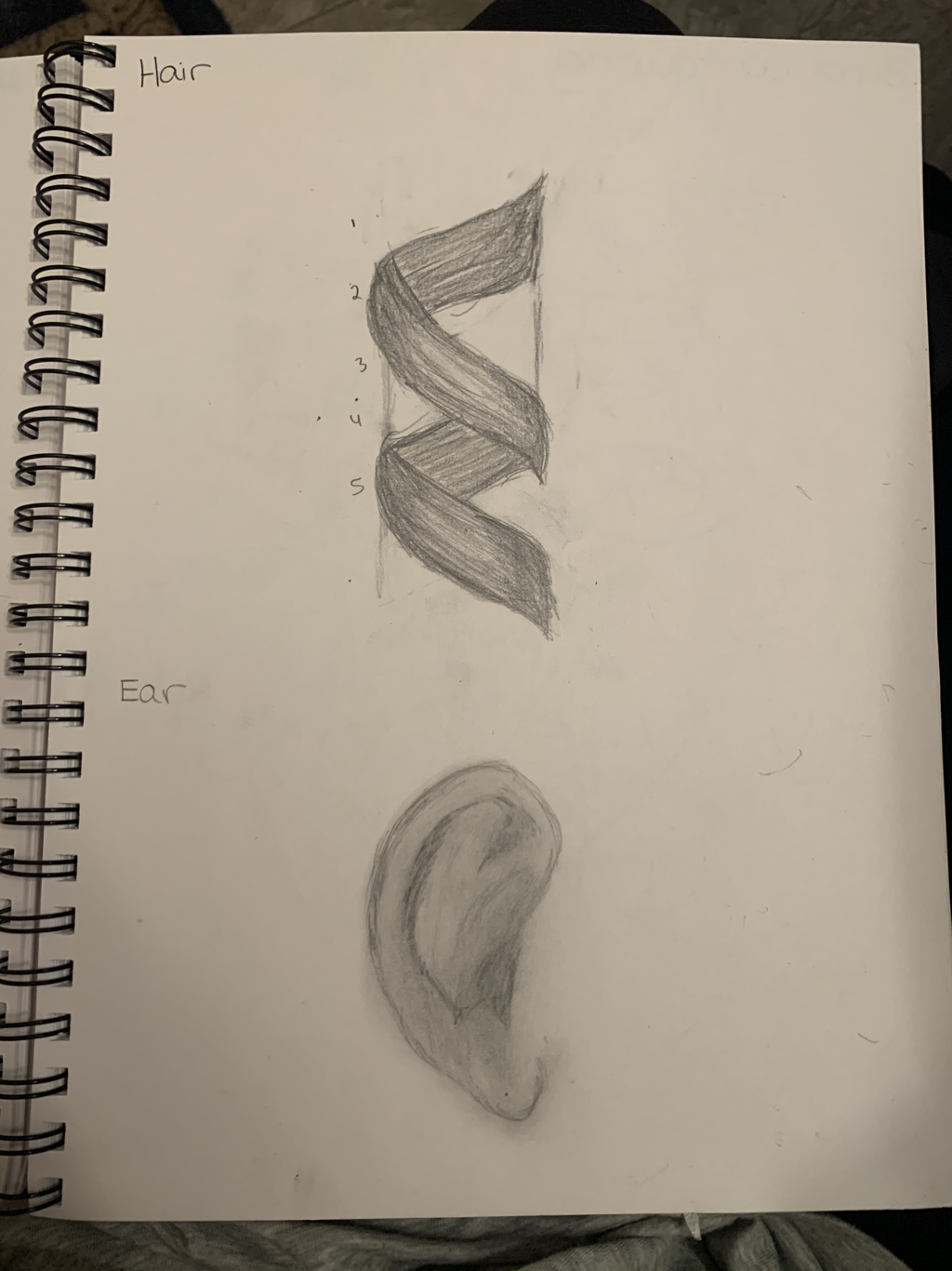
 1. I think the warm up that proved to be the most helpful was the eye warmup. I personally think that eyes are the main attraction of any person, and it helped to know how to draw them more realistically so they pop more. 2. I found the most surprising of the face proportions honestly the placement of the eyebrows and nose. It helped a lot looking at the eye for placements for the eyebrows without them looking unusual. Then for the nose, even though the nose can look relatively small, the placement and comparison proportions prove otherwise, which was surprising. Blog Post:
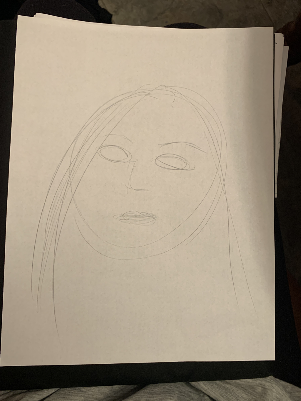
1. I chose to draw a portrait of myself, mainly because I just know myself the best.
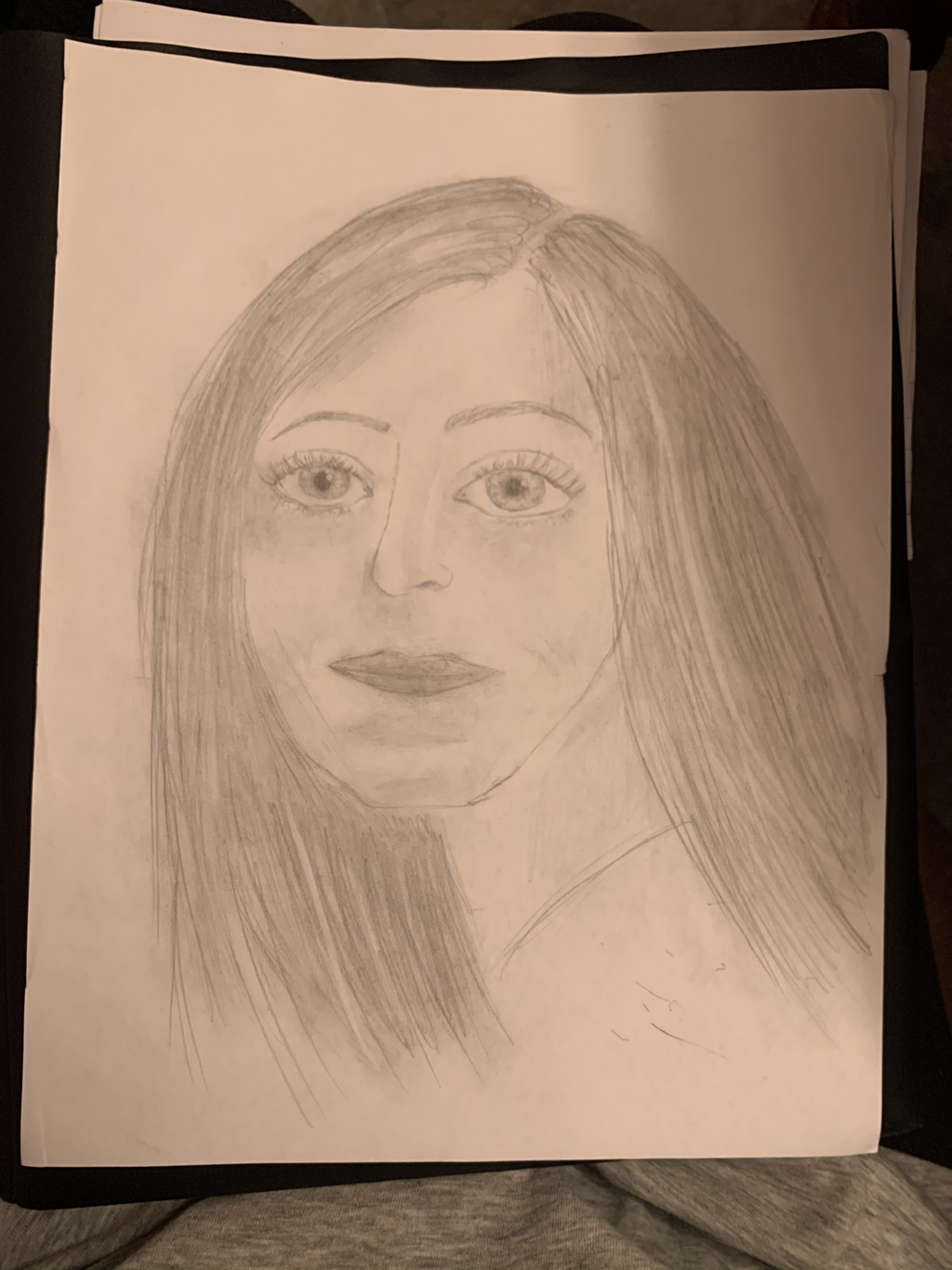
2. I just chose to be simple, so I used drawing paper and a pencil. 3. First, I drew the head shape and then I drew the eyes and all the details, along with that I also drew the eyebrows. Next, I decided to draw the nose and actually next I did the hair. After that, I shaded all the areas. Lastly, I drew and shaded the mouth, which was surprisingly hard for me. When I was all done, I went back and added even more details, especially in the hair area. 4. I found the eyes and the details to the eyes the most successful. What I really struggled with was trying to draw all the parts of my face and turn in slightly, because that was how I was in the picture I used. I would probably just change my head shape and probably the mouth if I were to redo this portrait. The head shape I just couldn't get right, and I couldn't turn the mouth the right angle while trying to keep it proportional. In Process
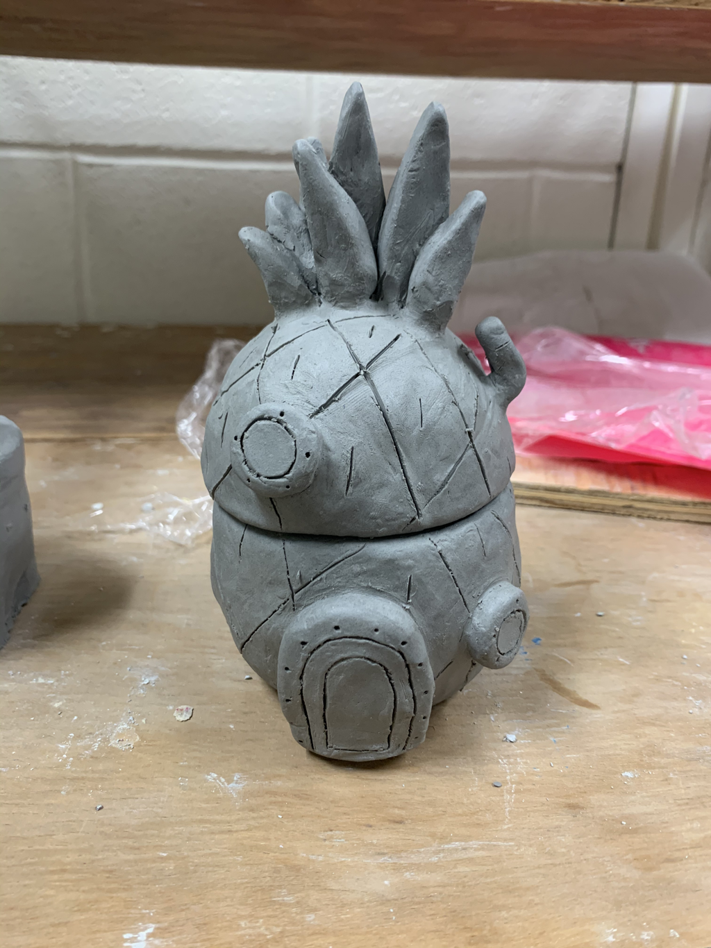
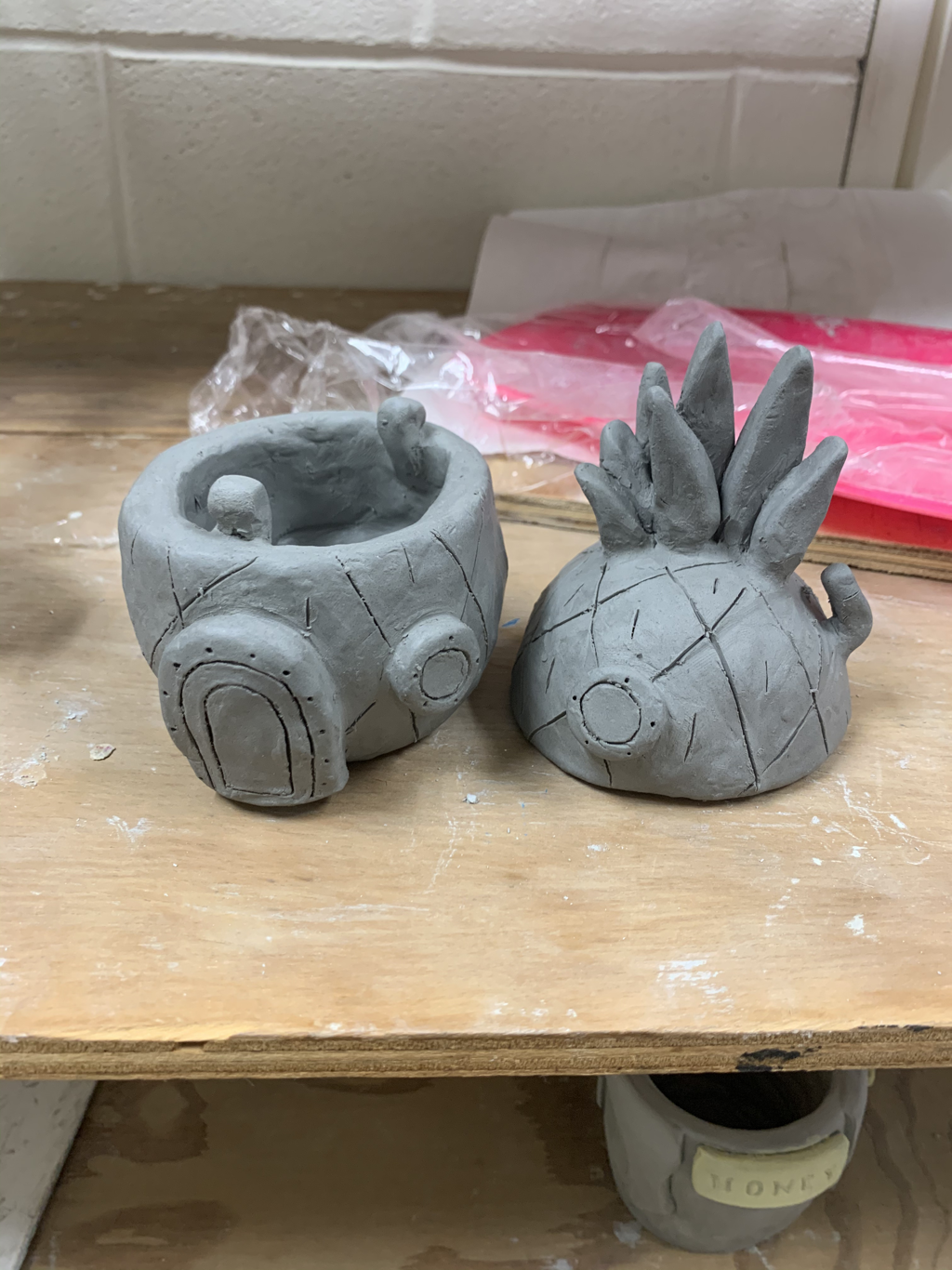
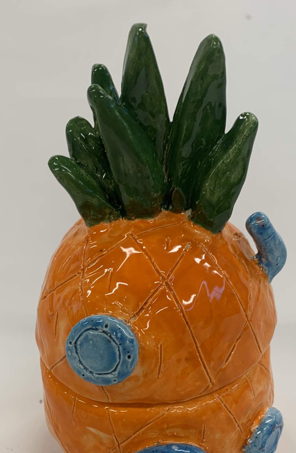
1. Well as you can see, I plan to make my piece into SpongeBob's pineapple from SpongeBob SquarePants. Since the pictures I took, it shows I'm almost done, I plan to put some color on my clay piece. After I paint it, to look exactly like it does in the tv show, I want to glaze it too. 2. The only things I've found difficult are trying to make the diagonal lines on a round shape and getting them to match up is really tough, Then, also trying to make the pieces on the inside of my clay project to stay in place, so my lid can stay on without squishing them. 3. What I found successful was actually the extra details on the outside of my clay piece to stay. I don't think I ever had to put them back on my piece, because they have never fallen off. They also have maintained their shape really well. 4. My first two steps were making the two pinch pots as my base of the pineapple. I then scored and slipped all the extra details of clay to the outside of my piece, like the door and the windows. After that, I took a needle tool and cut the little details into my greenware, like the diagonal lines of the pineapple and the extra detailing on the door and the windows. I also scored and slipped the little pieces of clay to the inside of my pot to secure the lid shut. Lastly, I took a wooden modeling tool and just smoothed the clay out around the door, windows, the pipe and the top of the pineapple. Finished
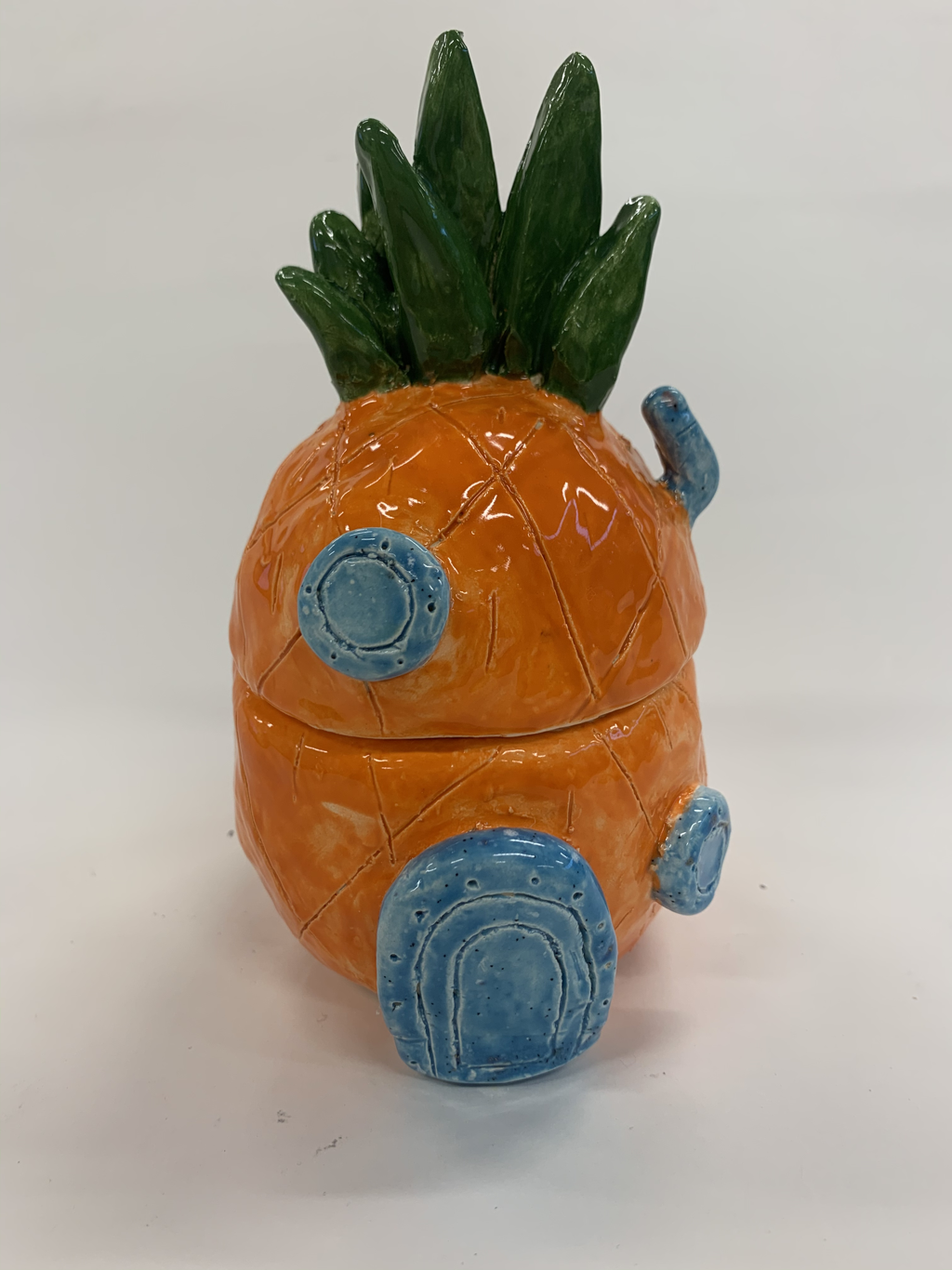
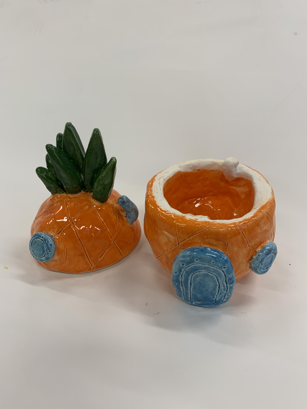
1. The only thing I did since I completed my in progress blog post was I just painted glaze on my piece. It was then fired in the kiln and I took my glazeware to take pictures of it, like the ones you see above.
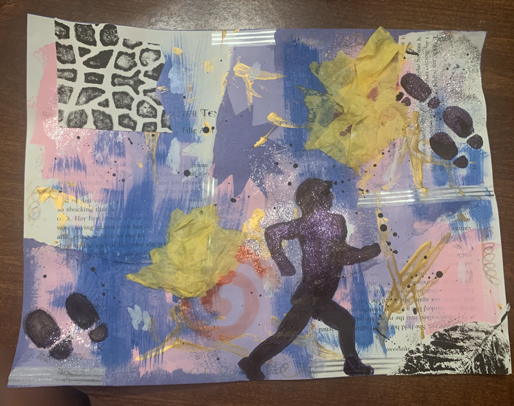
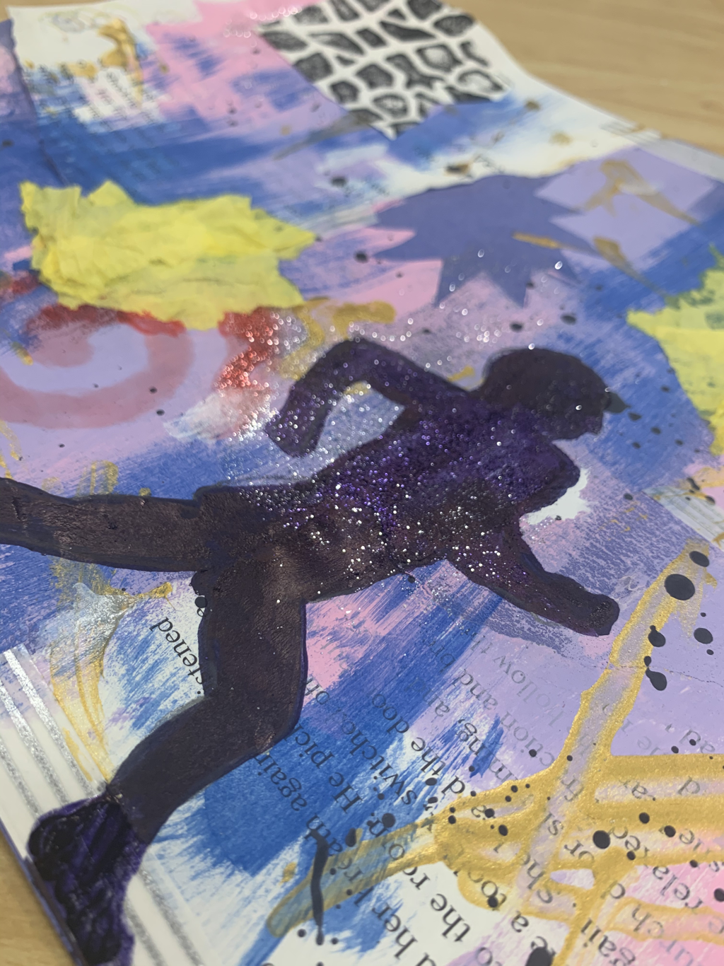
2. I feel like my detailing, like all the add ons and the lines in my piece, were successful. I was actually really pleased with the crown on top of my pineapple, and I feel it turned out really well. 3. The only thing I would change about my piece is maybe doing a better job on the glazing. In some spots you can see where I didn't paint enough coats of the glaze on. 1. I used 8 different mediums and 2 different techniques. The main medium I used was probably the book pages, which I put directly on top of my base, the construction paper, after I ripped the pages into pieces. Next, I used different color paints and just took a brush and just painted on sections of the construction paper. I took some glitter and glue, as I used for the book pages, and just did sections of glitter around the paper. After that, I took some decorative tape and just taped around the edges of the book pages and the outer edges of the paper for different textures. My final touches were taking decorative paper and yellow tissue paper and just scattering it around on my paper and gluing them down. Finally, I took a stencil and drew a running person in the middle of my paper and then drew some shoes walking around everywhere on my paper for more detail. I also took some more paint and just flicked some black specks on my paper. 2. My word was active. I portrayed it by drawing the person running in the middle of my paper, as if they are working out. Then, I also drew some footprints around my paper to symbolize people walking around.
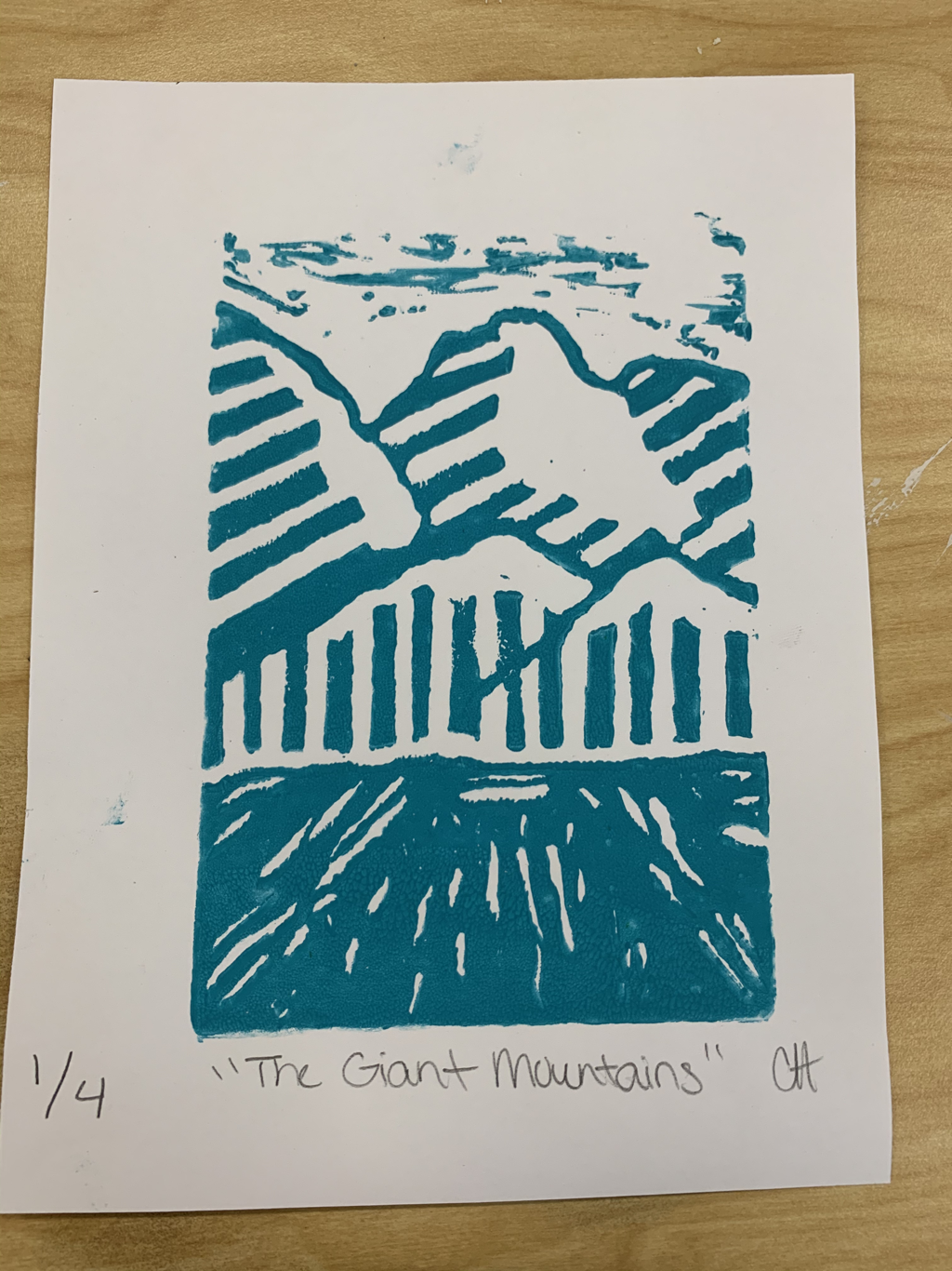
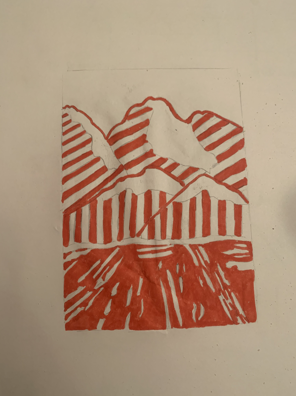
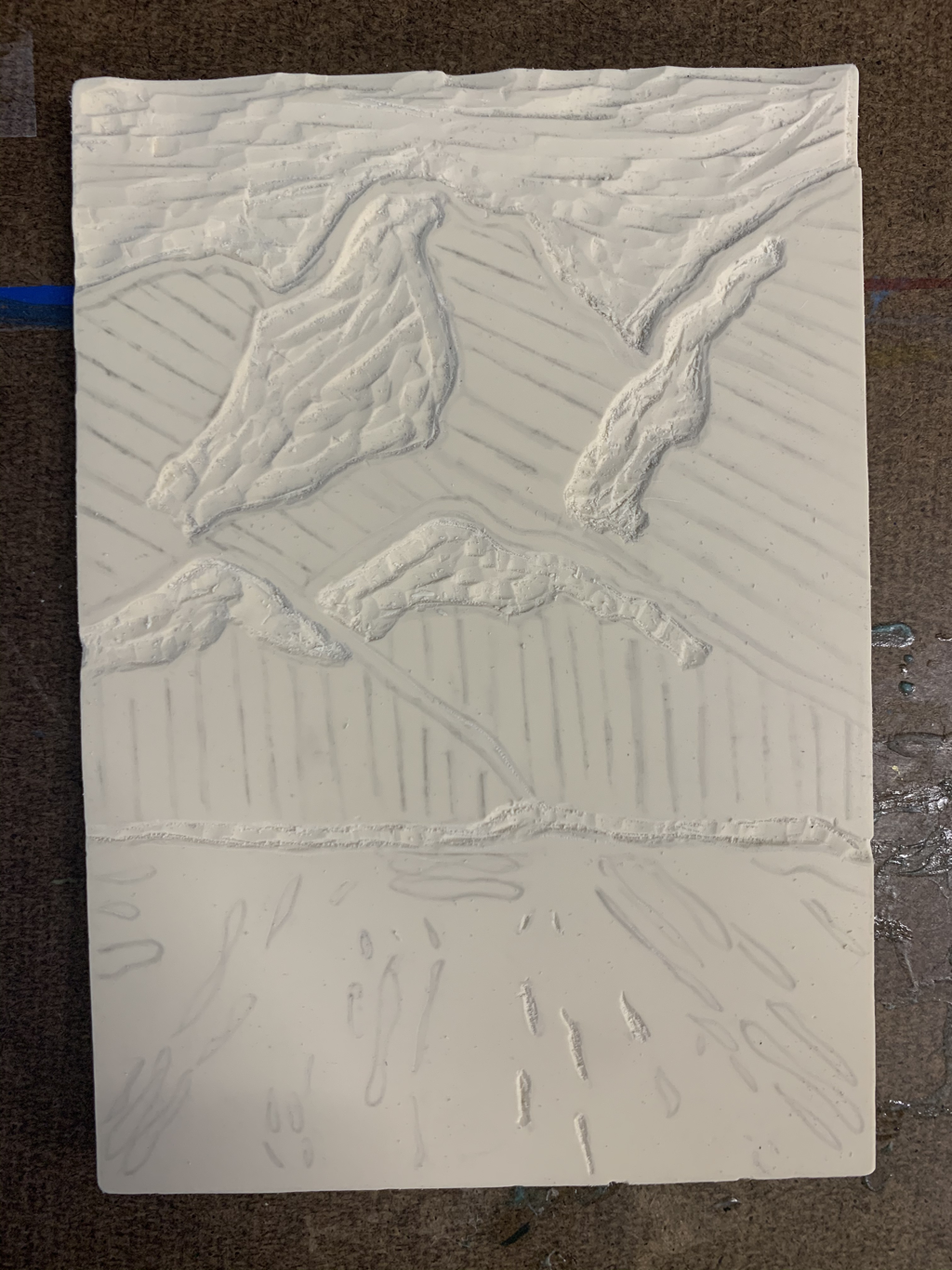
1. My piece shows off the theme of "line" in the mountains I carved. On my mountains I carved I cut lines going in different directions to give it some pattern. Then, I feel I even included lines on the ground just giving it some detail instead of it just being plain ink. 2. I feel my mountains were actually pretty successful, I just think they actually look pretty nice and neat. In my piece if I were to change something I'd probably do the sky different than carving it all out. In my piece I didn't carve the sky deep enough, because there actually wasn't suppose to be any ink in the sky. In all honesty, I feel like the sky turned out pretty good and the ink make it look like wispy clouds floating over the mountains.
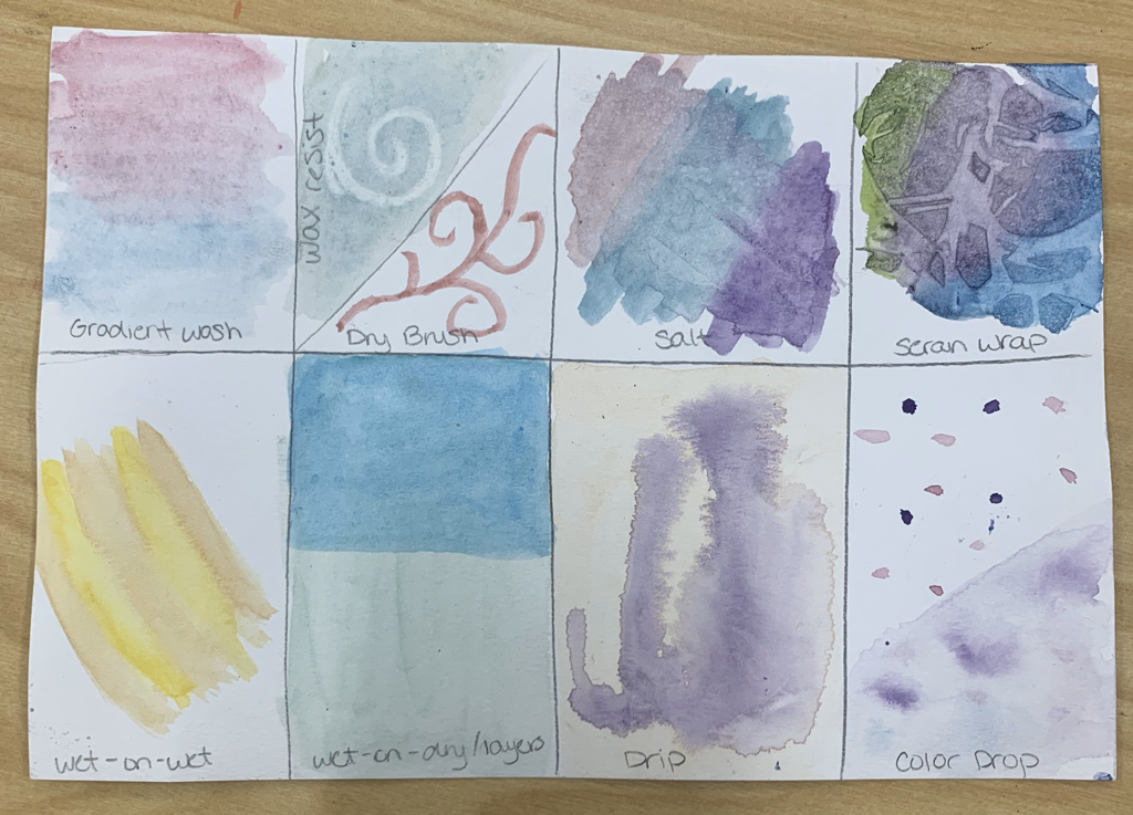
 1. The activity that I found the most helpful was probably the illustration from the children’s book because you got to see how all the different water color techniques actually play out on paper. Then, it was just an added bonus that we got to practice these skills as well during that activity. 2. What I like most about watercolor is that the colors can end so well. For example, if you were to create a sunset using the different techniques and right blending the sunset can look so smooth and pretty, but that goes for painting anything with watercolor. 3. What I found most difficult about watercolor was the fact that if you added too much water, the colors could run all over the place. Another thing that I found difficult was sometimes that I forgot to add a color or something, but I’d have to add that color on top of a dark color which doesn’t work and just ends up ruining that section. *Right below this my 4 warm ups, then my painting and it in progress*
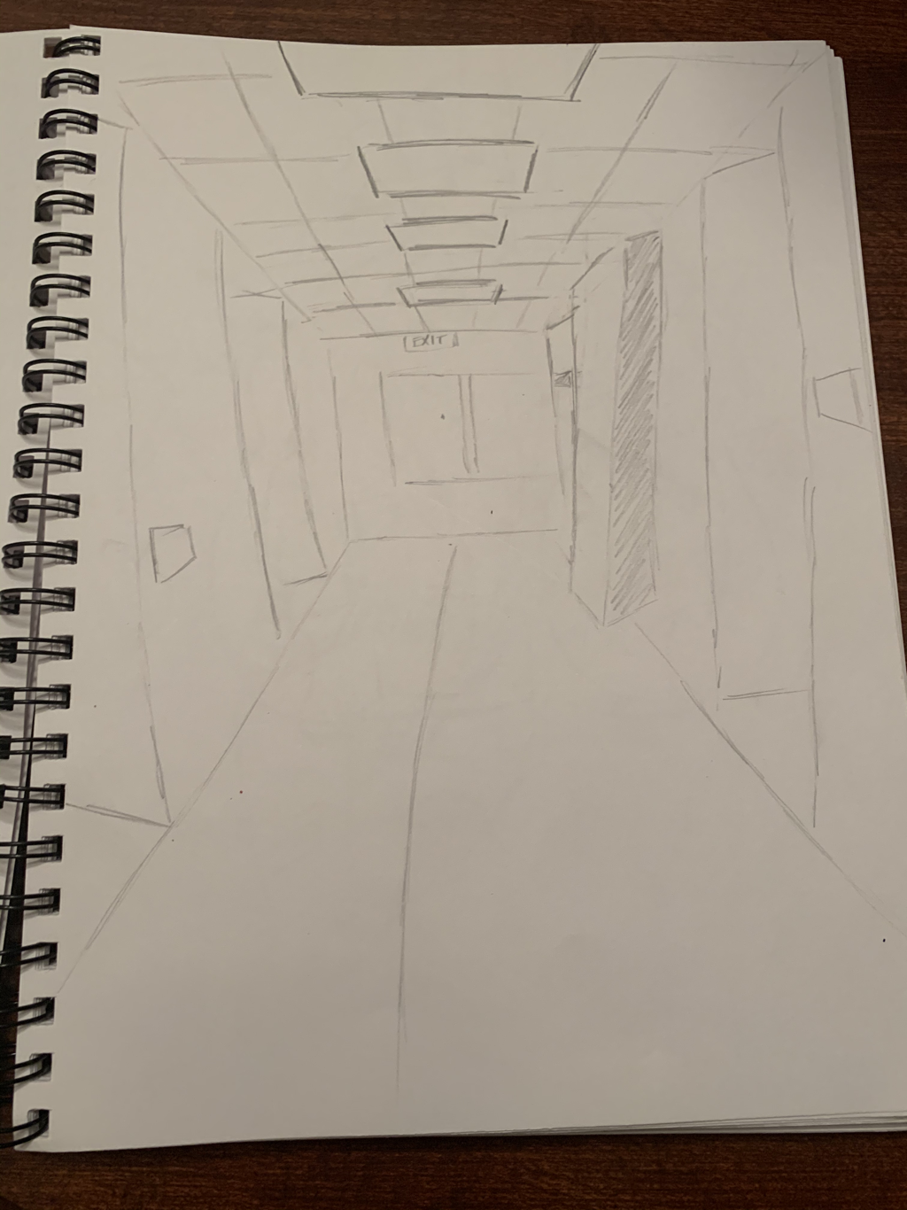
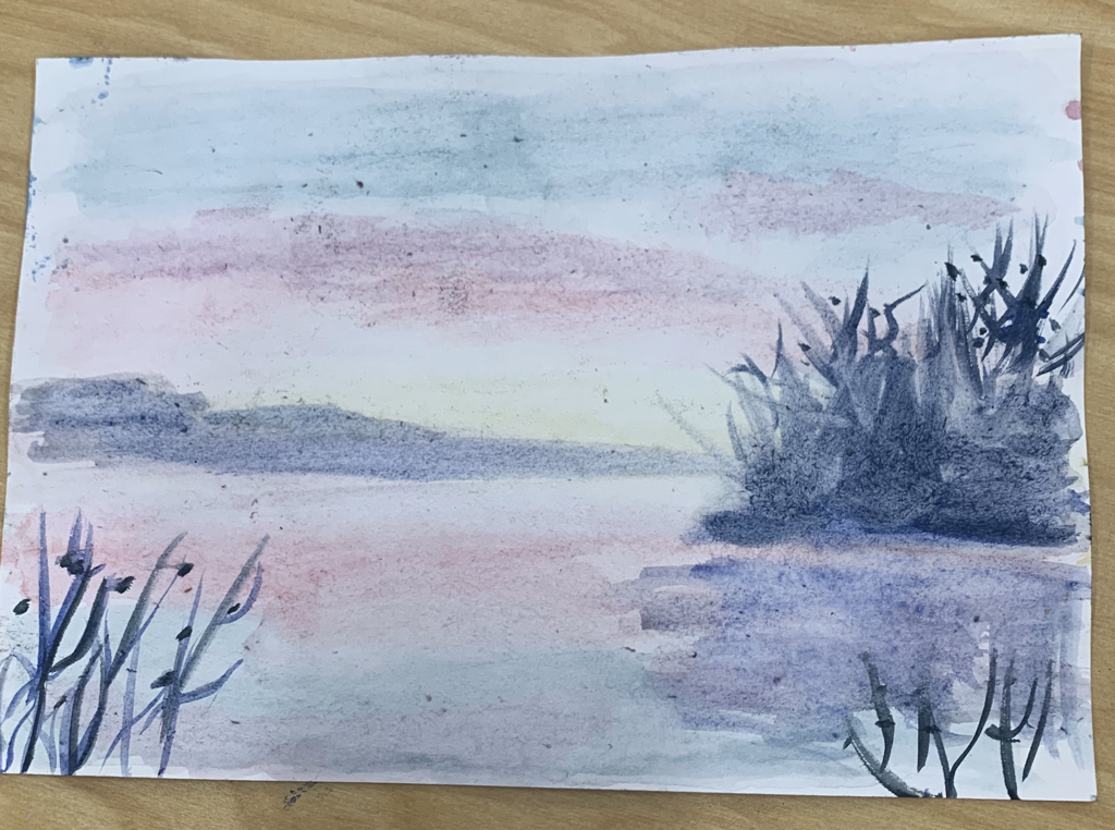
Watercolor Perspective1. In my painting I used 1 point perspective. 2. The photo I took was when I went to Louisiana for soccer. The picture is when we visited New Orleans. 3. What I found most difficult to do in my piece was probably painting the tree. I just found it hard to paint the branches over the leaves while making it look realistic. 4. My most helpful warmup was the watercolor techniques. The most helpful perspective warm up was the hallway drawing. The two warmups I picked help because first, the perspective helped me figure out how to draw windows or doors to make it look realistic and that 1 point perspective we were suppose to capture. I think they also help because the water color techniques showed me different styles and the best techniques to paint to create a certain aspect. For example, the gradient wash style showed me the best way to create a sunset.  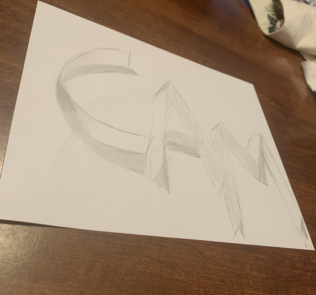
1. The place I decided to paint in my artwork is in Red Rock Canyon in Las Vegas. Besides the place being extremely beautiful, I decided to paint it because my soccer team and I went there for soccer. I've been playing soccer for around 6 years now, and I have it about 4-5 times a week. Soccer is very important to me, so that's why I decided to paint this. 2. The most challenging piece in my painting was probably trying to make all the bushes in the front look realistic and trying to add the right amount of shading at the bottom and throughout the bush. 3. I was actually really proud of my mountain range in the background and the sky. For the mountain ranges I feel like I did decent on adding different colors to try and create that rock looking effect. Then, for the sky I just feel like my transitions from the darker blue to the lighter blue then to the white was really smooth. 4. In my painting the first thing I did was the sky. I started off with the darker blues then I kept adding the lighter blues and finally the white right on top of the mountain range. I next did the mountain range with one solid color, then I went back and added tons of different colors to create that rock effect. Next I did the green weeds in the back and once again I went back and added different colors of green to create a more realistic effect. After, I tried to do the sand a light color to match across the rest of the painting, and on top of that I splotched some more green paint to create the bushes up close. Lastly, I did the rock in the corner and as I did throughout the whole painting, I went back and added spots of different colors. The very last things I did was add more shading to the bushes and I tried to dab colors onto my sand to create a sand effect. *I didn't get a picture of my painting in the process* *Below is my painting warmups and questions* 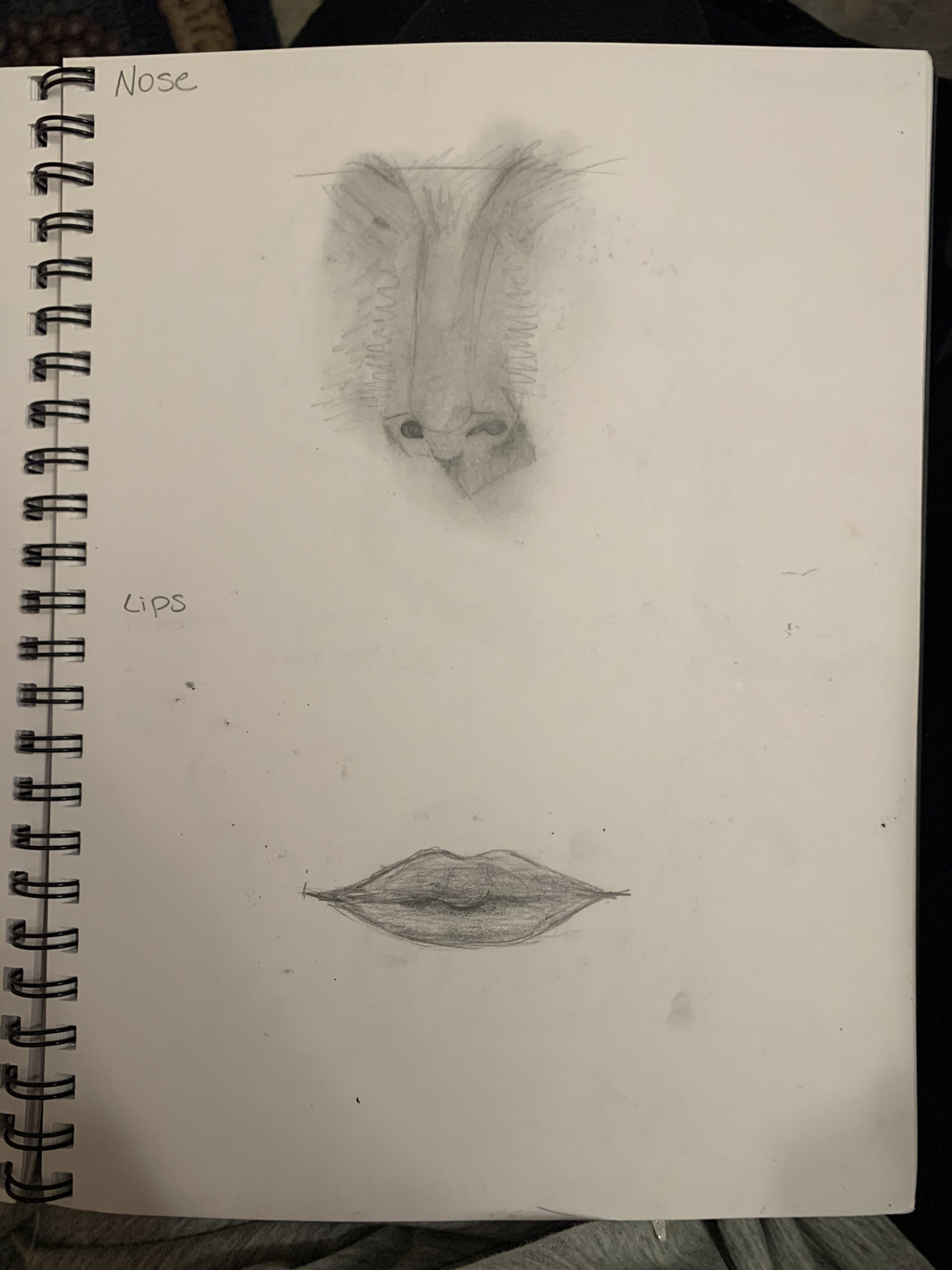 Acrylic warmup   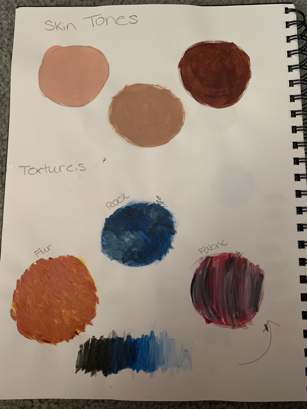 1. For acrylic painting, I learned that shading and adding highlights to certain parts of your painting can make a big difference.
2. I think the most helpful warmup for my painting was the mixing colors to form brown. That’s because In my painting I have a lot of earthy colors and knowing how to make browns really helped. 3. I learned the most from painting the different textures especially the rock because my painting has a lot of rocks in it. In the warmups my textures weren’t really the best looking, but I feel that in my painting the texture got better looking and more realistic. 4. One way to make brown is mixing two opposite colors on the color wheel, such as blue and orange, and then you can add white to make it lighter or add more blue to make it darker. 5. You can tone down certain colors by adding white to make the color less vibrant. Then, you can also use the color wheel and use the colors opposite the color wheel to dull down the color. For example, if you wanted to tone down red you can add some green paint. |
AuthorWrite something about yourself. No need to be fancy, just an overview. Archives
January 2020
Categories |


 RSS Feed
