|
Brainstorming/Famous Artist Research: 1. Gerhard Richter 2. Joan Miro  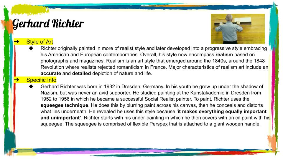 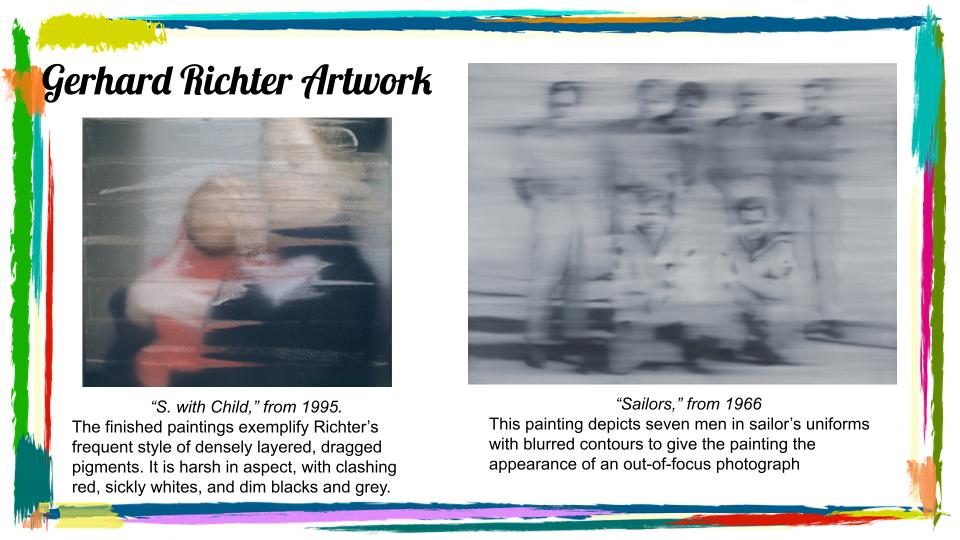  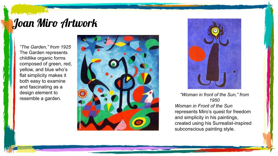 Sketches and References:
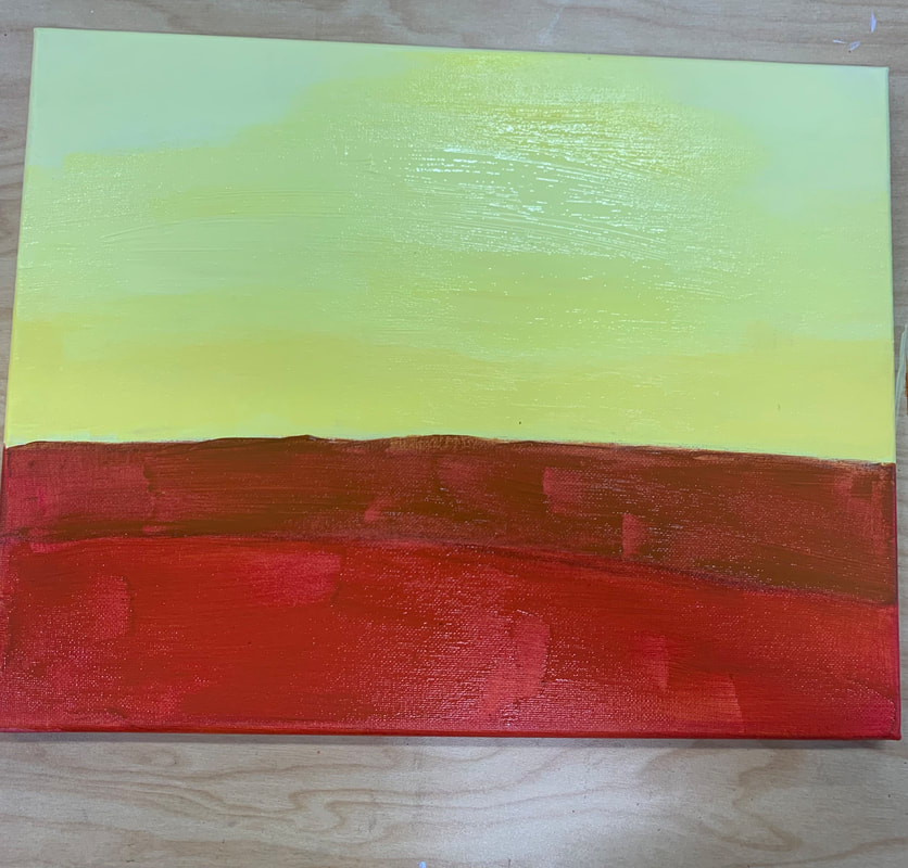
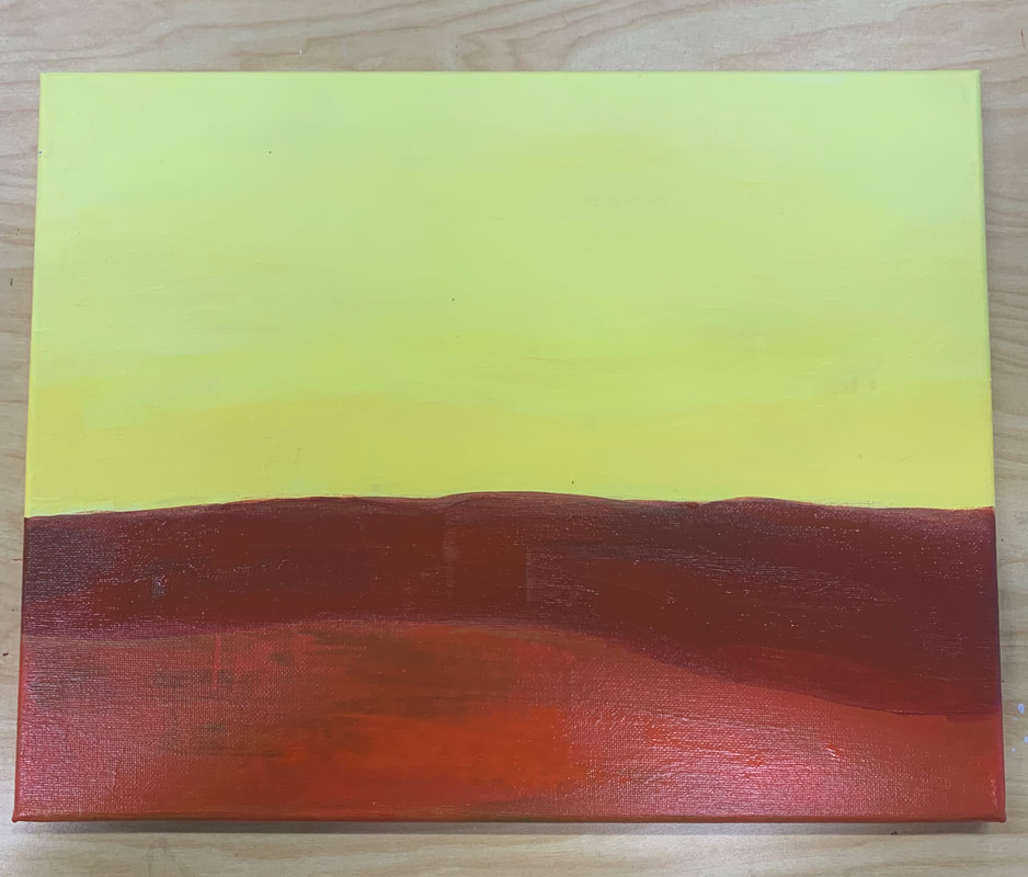
Final Color Sketch: 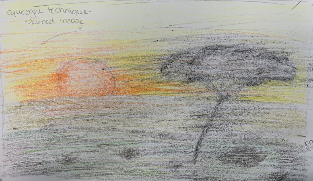 In Progress Pictures:
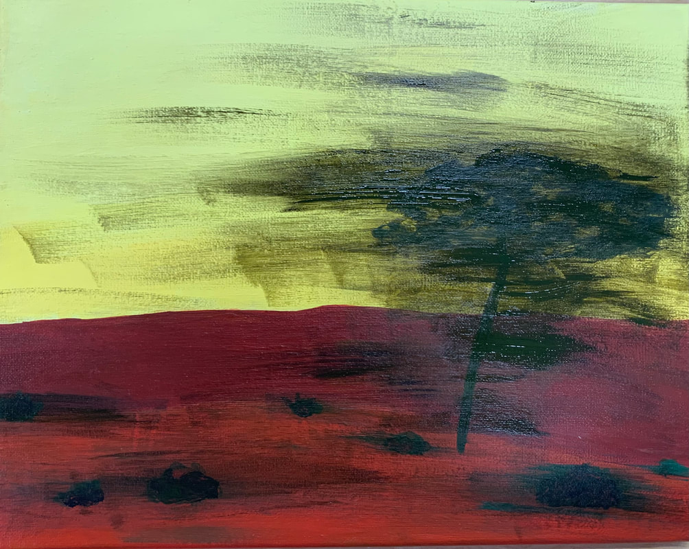
Final Painting: 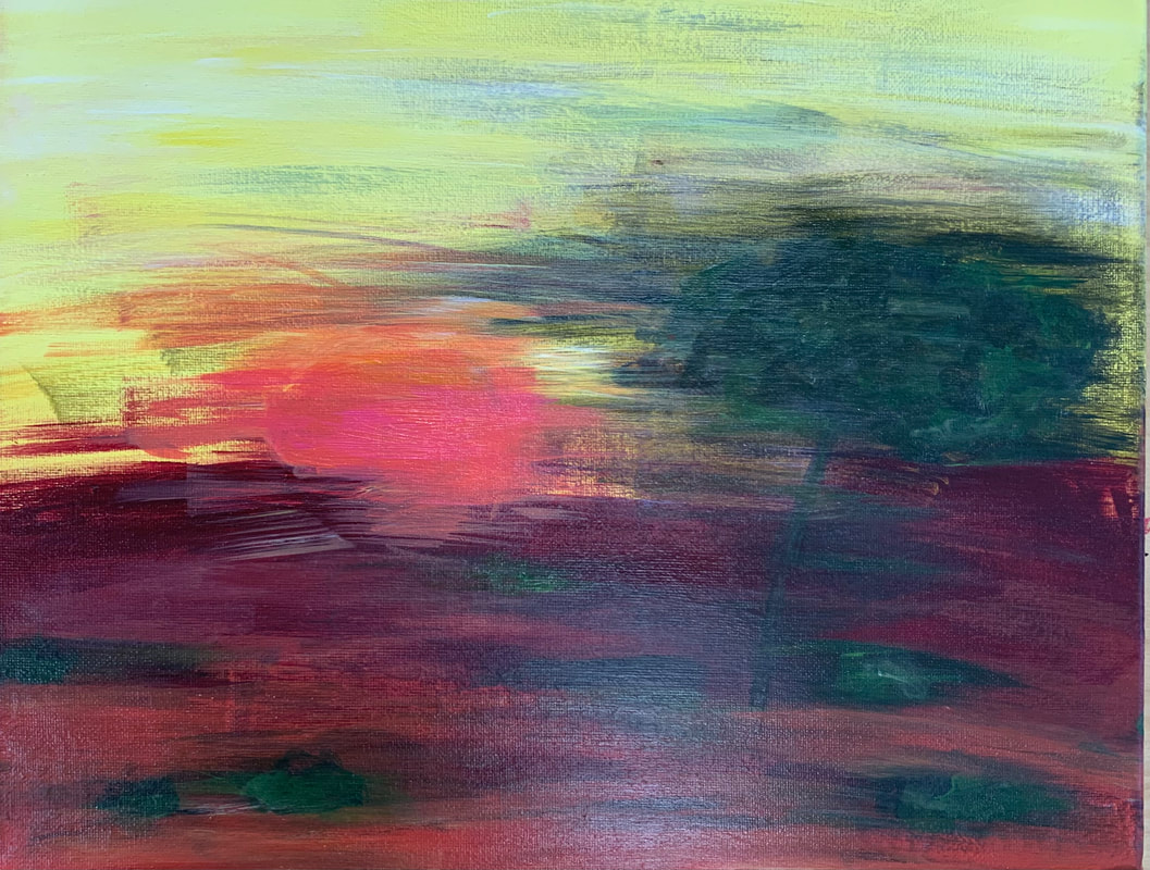 Self Evaluation Questions:
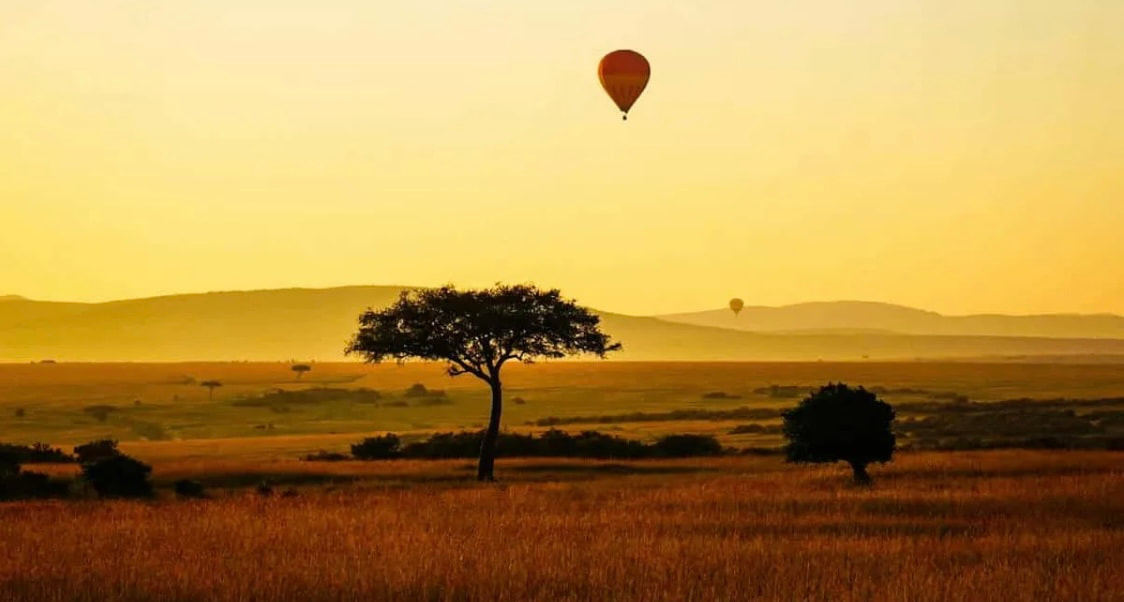
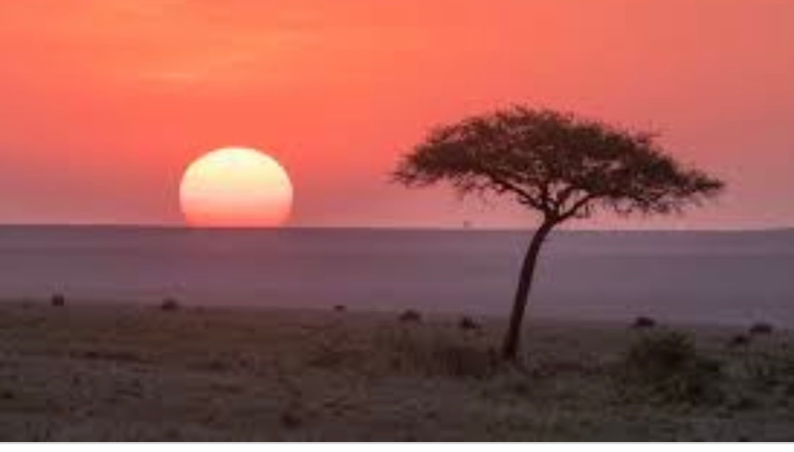
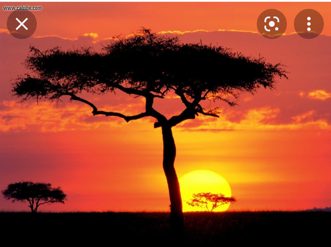
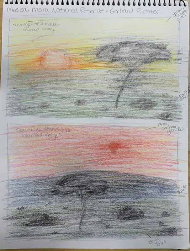
1. Name- Gerhard Richter
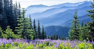
3. The most challenging part of this project was trying to mimic Richter's technique without using that actual tool. While mine and his pieces are similar in a way, they still look different in how the paint was guided. It was tough to smear the paint while trying to keep the essential shape of the landscape and after my painting had dried overnight. 4. I feel my color choices accurately reflect the reference image I chose while also incorporating Richter's normal color choices. Richter normally uses earth tones in his paintings which is why I painted the ground, bushes, and trees to be reddish browns and greens instead of black and dark brown like the image was. I also didn't use too much black because that would consume the painting, which isn't what I wanted to do. 5. I feel like my landscape reflects Richter's art because his pieces are more simplistic and include very few colors, which is why I picked my landscape to be simplistic with minimal colors. Richter also doesn't normally paint landscapes, as most of his art is portraits or abstract art. 6. I definitely think he would say that I should try using an actual rubber squeegee to paint, so my painting looks even more similar to his. While a paintbrush mimics the technique in some aspects, using an actual squeegee would highlight the squeegee effect I was striving for. I also think he would say that I should try to define the shapes on my landscape a little more so you can still see the blurred effect and still visualize the image that I was creating. 7. If I were to do this project again, I definitely don't think I would brush the image out as much. I think I did it too much in my painting that the images just started to look like blobs on my canvas. I also think I would try to blur my image out right after I put down the fresh paint more because in the painting I did, I let the paint dry too much, and it was harder to smear, so I had to put extra paint on the canvas.
0 Comments
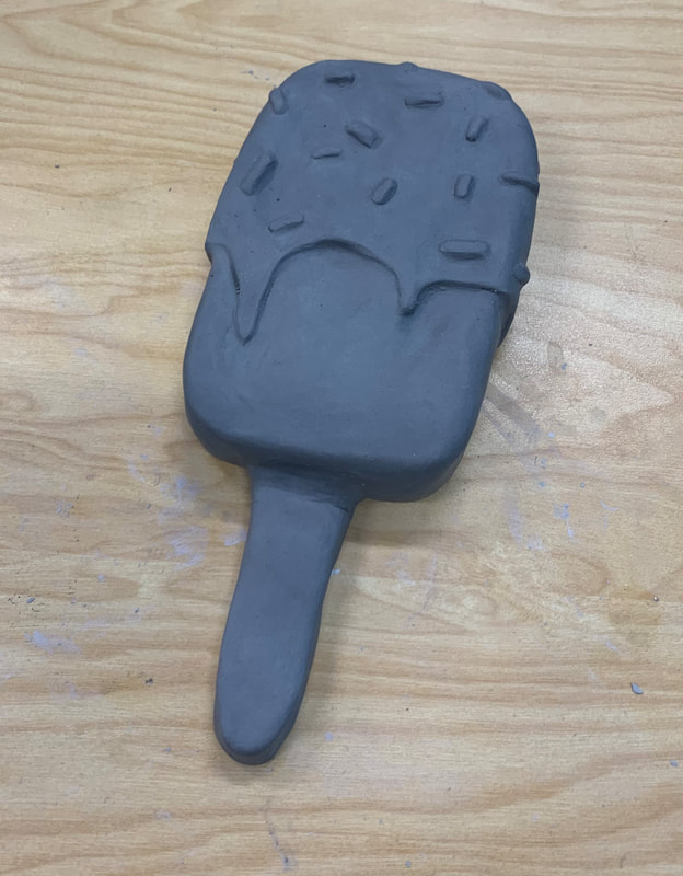
Brainstorming Ideas:
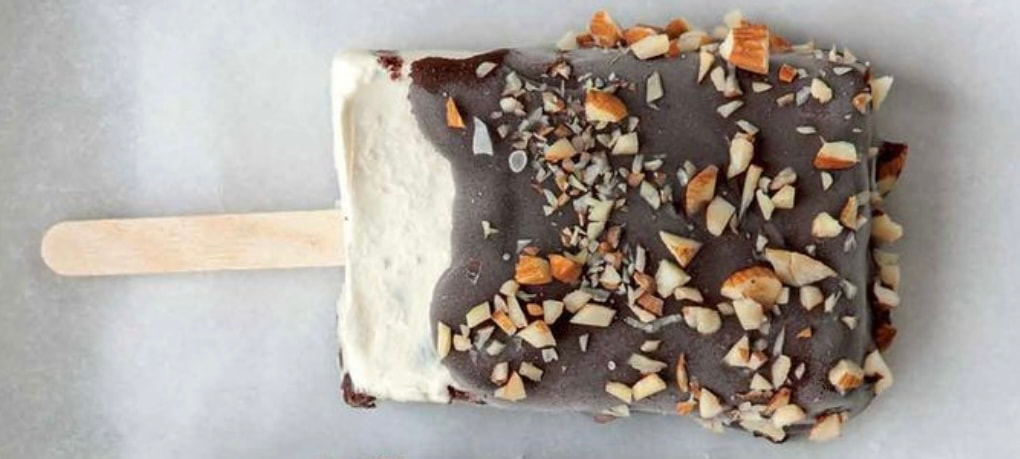
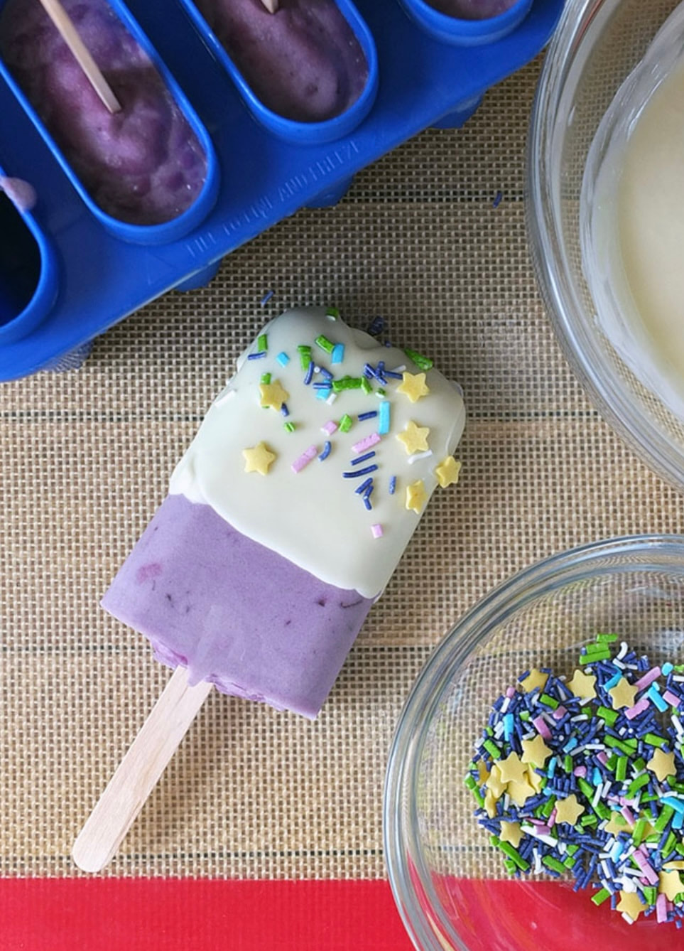
Research on Pop Artists: 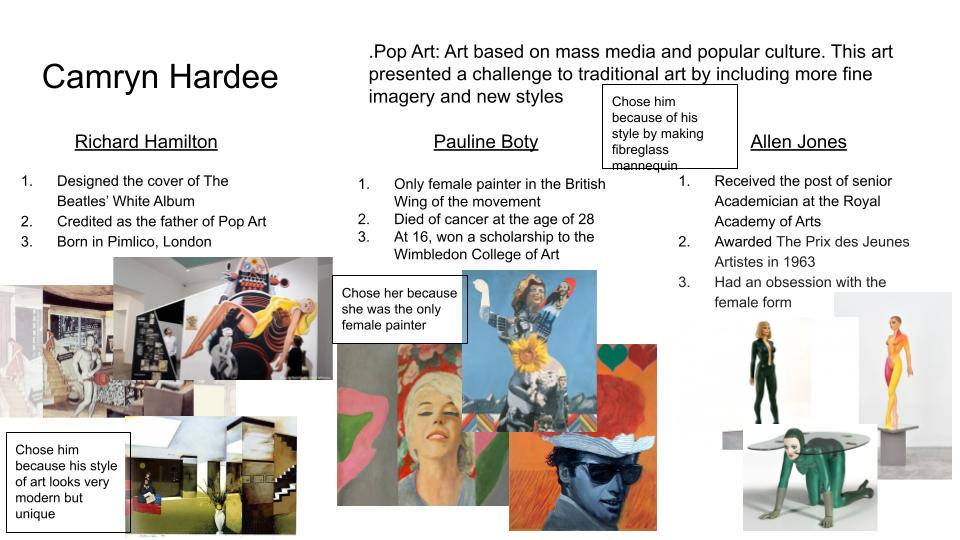 Sketches and References:
Final Color Sketch: 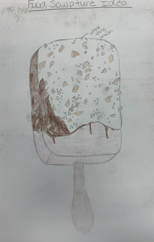 In Progress Pics:
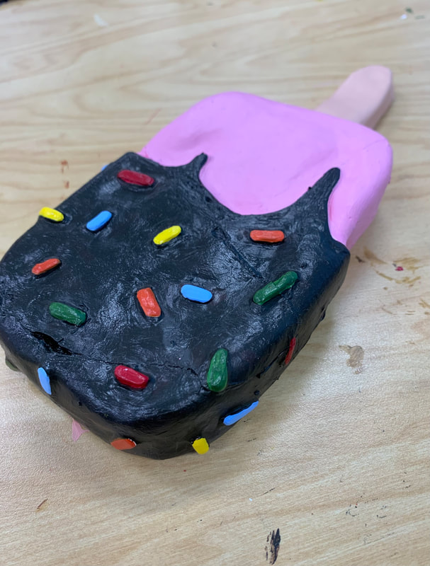
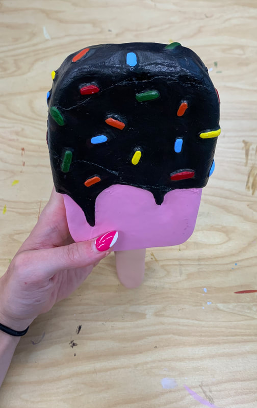
Final Painting:
Self Evaluation Questions:
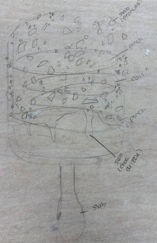
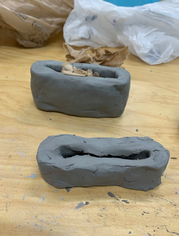
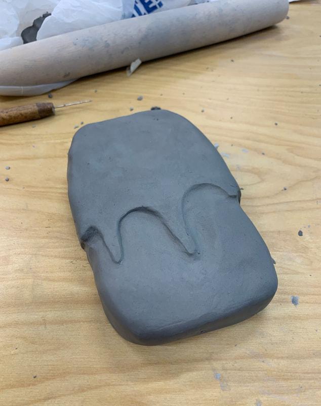
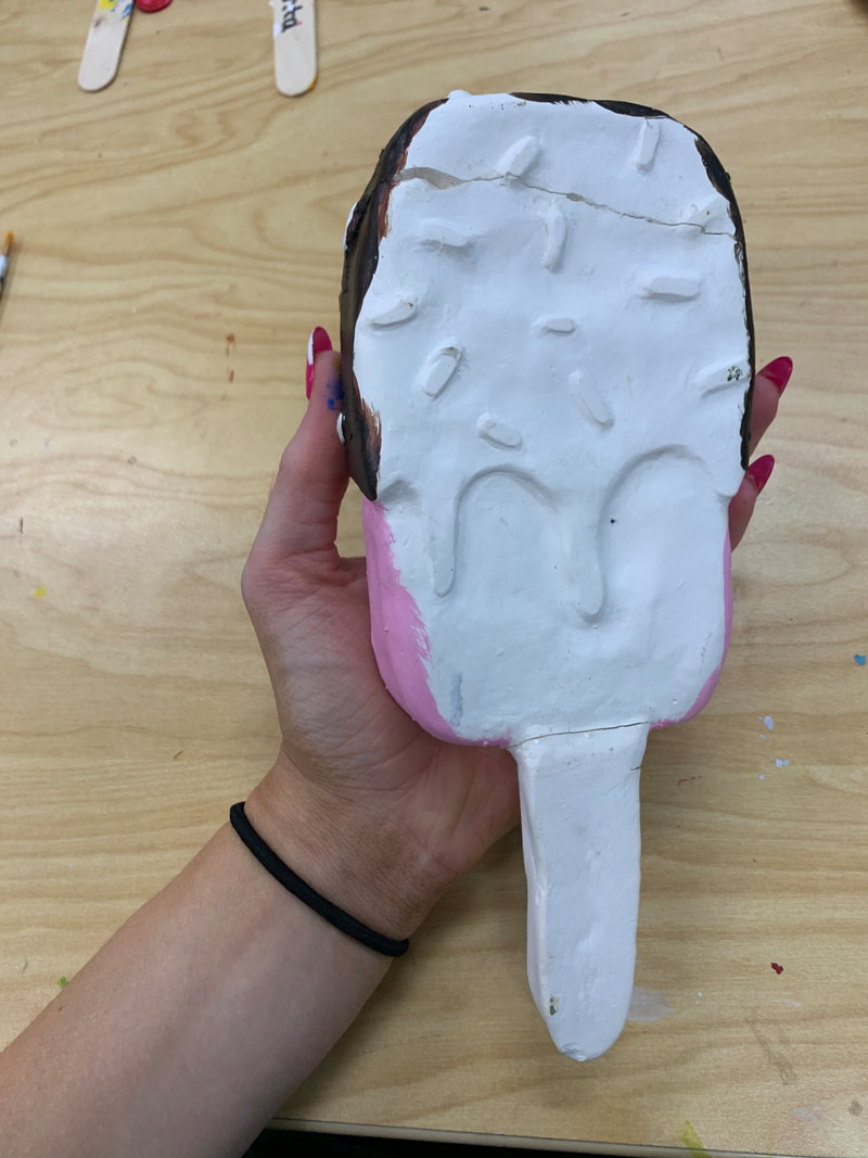
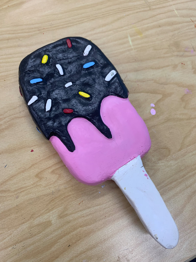
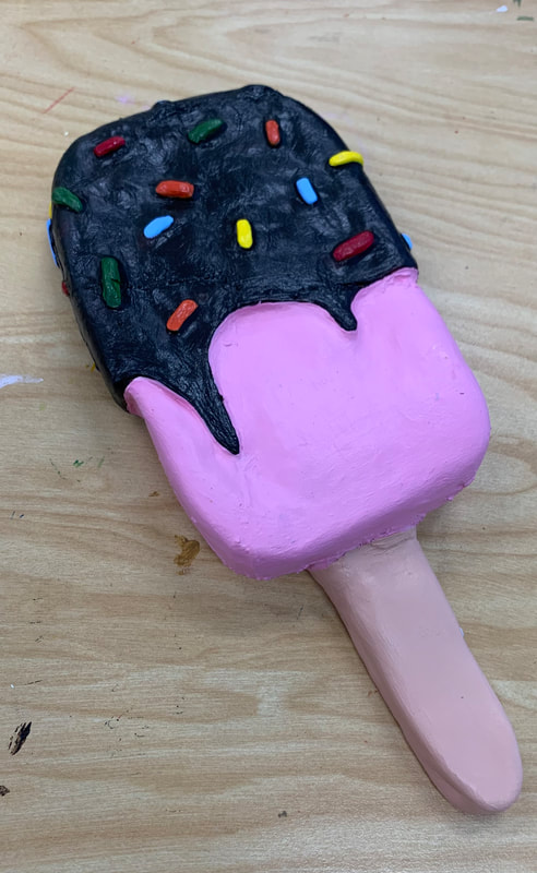
1. I thought my craftsmanship was alright. When I was constructing the clay piece, I thought it was going really well; the only tough thing was creating the body of the ice cream bar without it caving in and the sprinkles. Every time I would flip the ice cream bar, the sprinkles would get smooshed. Overall, besides it blowing up in the kiln and missing a few chunks, I still think it came out good, and with the paint, I feel like it really pulled everything together again and made it look clean. 2. The most difficult part about this project I mentioned above: was constructing the body of the ice cream bar without it caving in along with the sprinkles because they are so small and the clay was so delicate to press into. Some of the sprinkles did still get squished, but painting over them helped, and you didn't notice it as much. 3. For my piece, I used all three techniques: pinching, coiling, and slab building. For the top and bottom of my ice cream bar, I started with a pinch pot that I then made into a rectangular shape. I then used multiple coils to create the ice cream body and make it easier to slip and score together. Then I used slab building to make the stick of the ice cream bar along with the sprinkles to some degree. 4. For my piece, I honestly felt the color combinations could have been anything. Ice cream bars come in every shape, color, and design, but sticking to the generic idea of a strawberry ice cream bar covered in chocolate and rainbow sprinkles worked together well and made it look realistic. 5. I think my piece is interesting from all angles and views. While the piece is essentially the same throughout, I feel like the color and different shapes and designs made it cool to look at from any angle, especially looking at it from an upward or downward angle. Also, it's appealing to look at all the different textures and handiwork. 6. The difference between something 2D and a sculpture is a sculpture requires you to visualize and construct height, width, depth, and rotation. You have to construct a sculpture so it can be perceived from all sides and angles, while a 2D object, you don't have to do. You can design something in 2D taking into account height and width, but you don't have to worry about finishing different sides or rotating an object to study it. 7. For the texture in my piece, I carved out the ice cream on the bottom in shape. I wanted to make it look like the top was covered in chocolate, creating that 3D effect. Next, I tried to craft the body of the ice cream bar as smooth as possible to create that smooth, finished look that ice cream bars normally have. For the wooden stick, I tried to press down on the brush more to create that wood texture look. Then, for the sprinkles, I sculpted them onto the bar and just smoothed out the edges so they would remain on my clay piece. 8. I think my piece does look like the actual food. I accomplished this by sculpting it into my reference pictures. As I said before, making the chocolate 3D on the bar makes it look more realistic than if I just painted the top part brown. I also used a shiny brown coat for my chocolate to create that fresh chocolate dip look. My color choices also make my piece look realistic because most times when people think of ice cream, they imagine strawberry, chocolate, or vanilla, which is why I incorporated those colors to mimic strawberry and chocolate ice cream. 9. The research of pop artists helped influence my piece because it gave me ideas and techniques that I could use to create my own visually appealing effect in my sculpture. Learning about different art techniques gave me options on how I wanted to approach this project. 10. If I were to do this project again, I wouldn't make my clay as thick since it blew up in the kiln. Even though I did make my piece hollow and stuffed it with paper towels, I still feel like I made some sections of my piece too thick, especially the top part of my ice cream bar where the chocolate was. 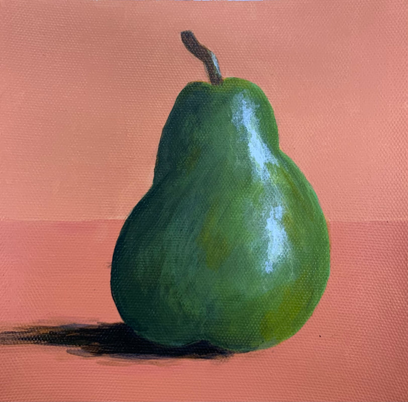 For this assignment, I started by painting the background and a surface for my painting. Once that dried, I then drew a pear on the canvas paper in pencil. I started with a medium shade of green that I painted all over my pear, and then started adding darker and lighter shades of green after that paint had dried. I used circular motions in some areas to create nice blending between all the colors, and even added shades of orange and yellow to the pear. Next, I added white highlights on the right side of the pear to show where the light source is. I also put white paint on the stem after I mixed orange and blue together to create a brown for the stem. Lastly, I took the brown and added black to it to create a nice shadow color on the left side of the pear. To finish off, I repainted over some of the edges that needed cleaned up.
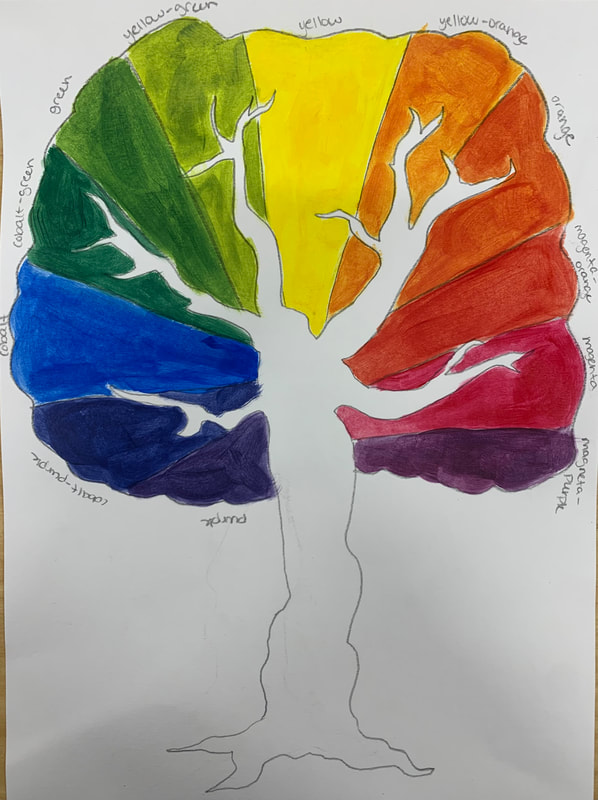 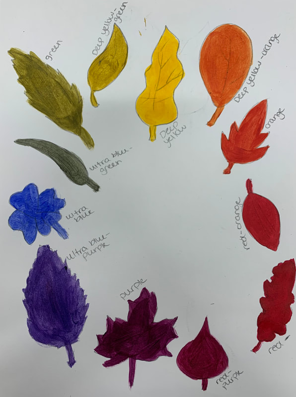 For this assignment, I took the 3 primary colors, magenta/bright red, cobalt/ultramarine, and chrome yellow/deep yellow, and painted a color wheel that shows three sets of colors. For my color wheel itself, I drew a tree and leaves and then painted the primary, secondary, and tertiary colors I made with the different sets of paints. I then labeled the colors I created as magenta-orange, magenta, magenta-purple, and so on.
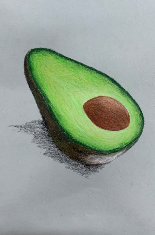 I chose a grey paper and used an avocado off the internet as my reference picture. I started off shading in the peel with brown, green, black, and a light green. I used white to create a light source on the bottom of the peel. I then colored in the avocado part with different shades of green and white, and then I shaded the core in with red, brown, black, and a light brown. I used white and black to add highlights and add details throughout the core. Lastly, I used black and created a shadow on the backside behind the highlights of the avocado.
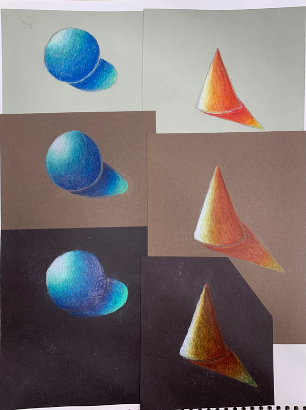 On each colored paper, I drew a sphere and a cone. For each shape, I identified a light source and a cast shadow and I picked a light, medium, and dark color to shade in my shape with the proper shadows and highlights. My light colors were mint and yellow, my medium colors were light blue and orange, and my dark colors were dark blue and red.
Brainstorming Ideas
Sketches  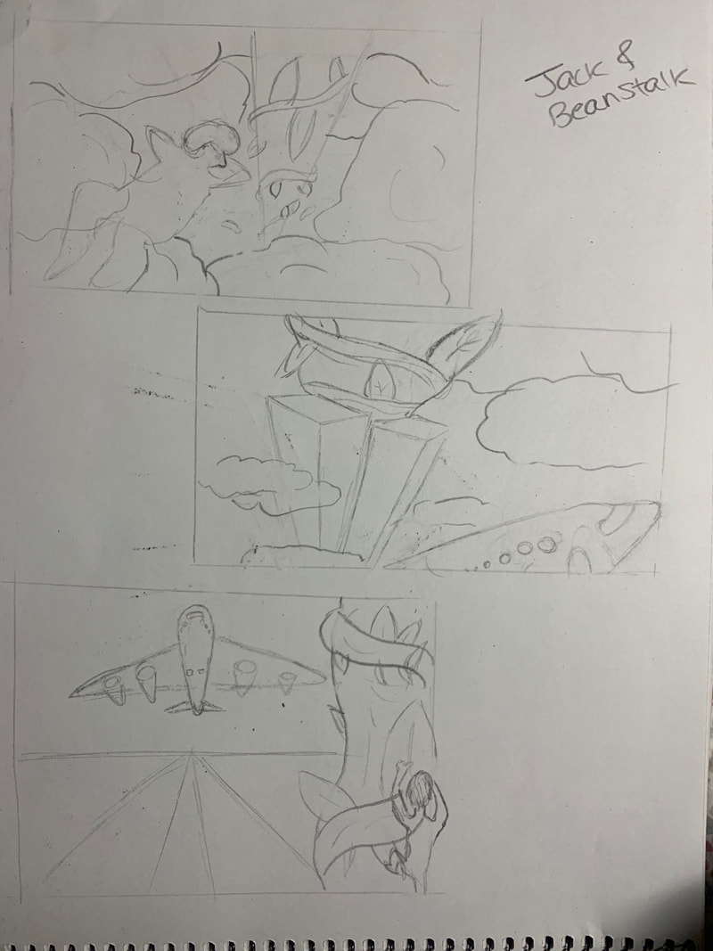 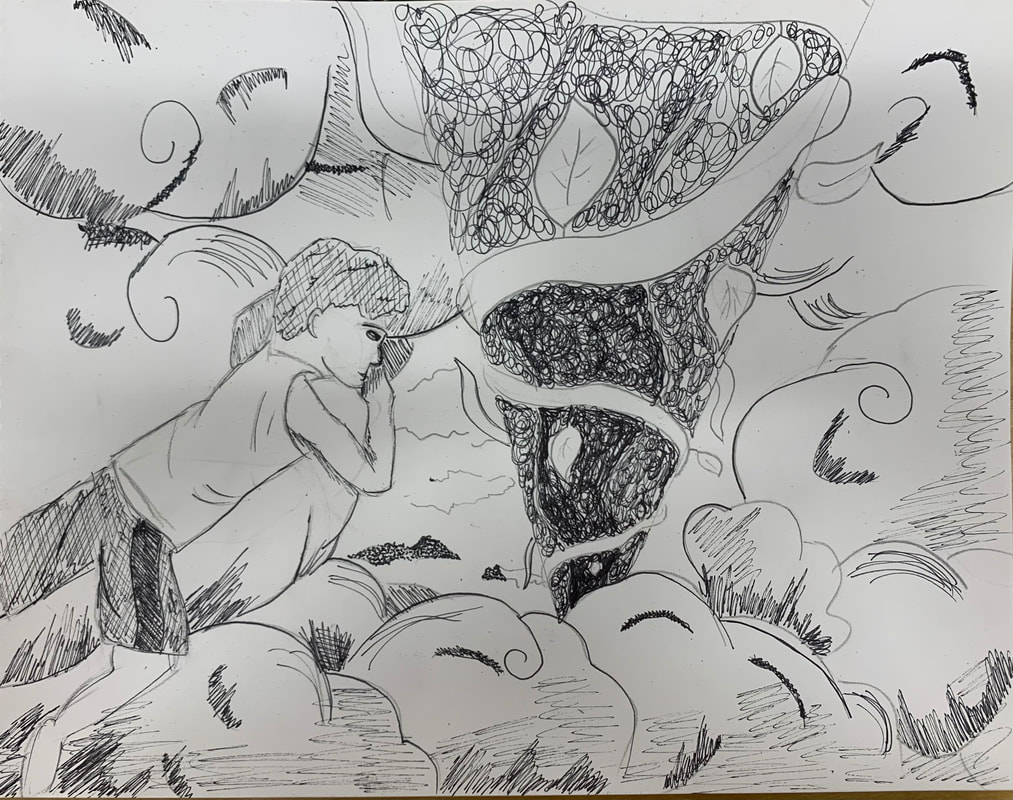 In Progress PIctures 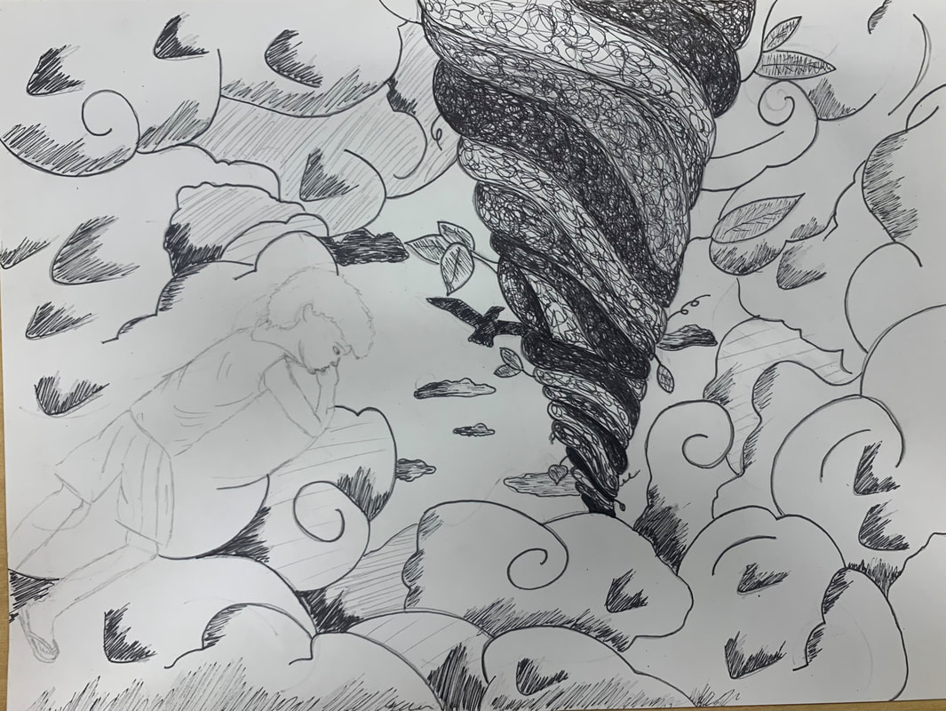 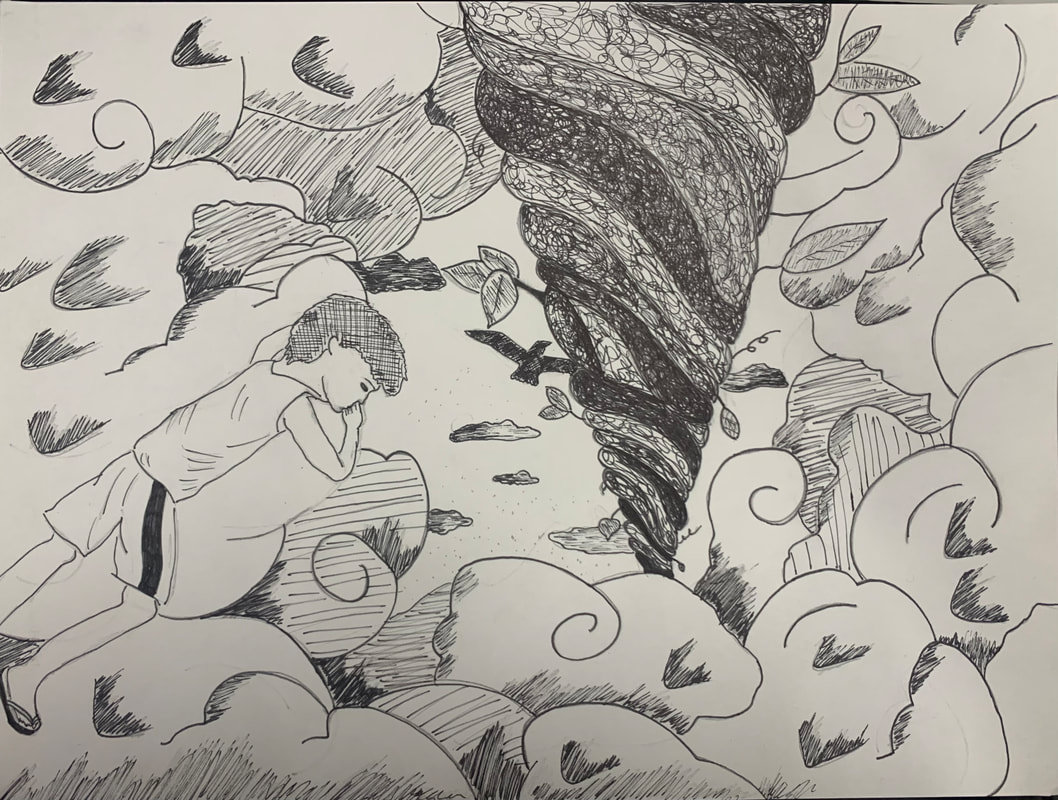 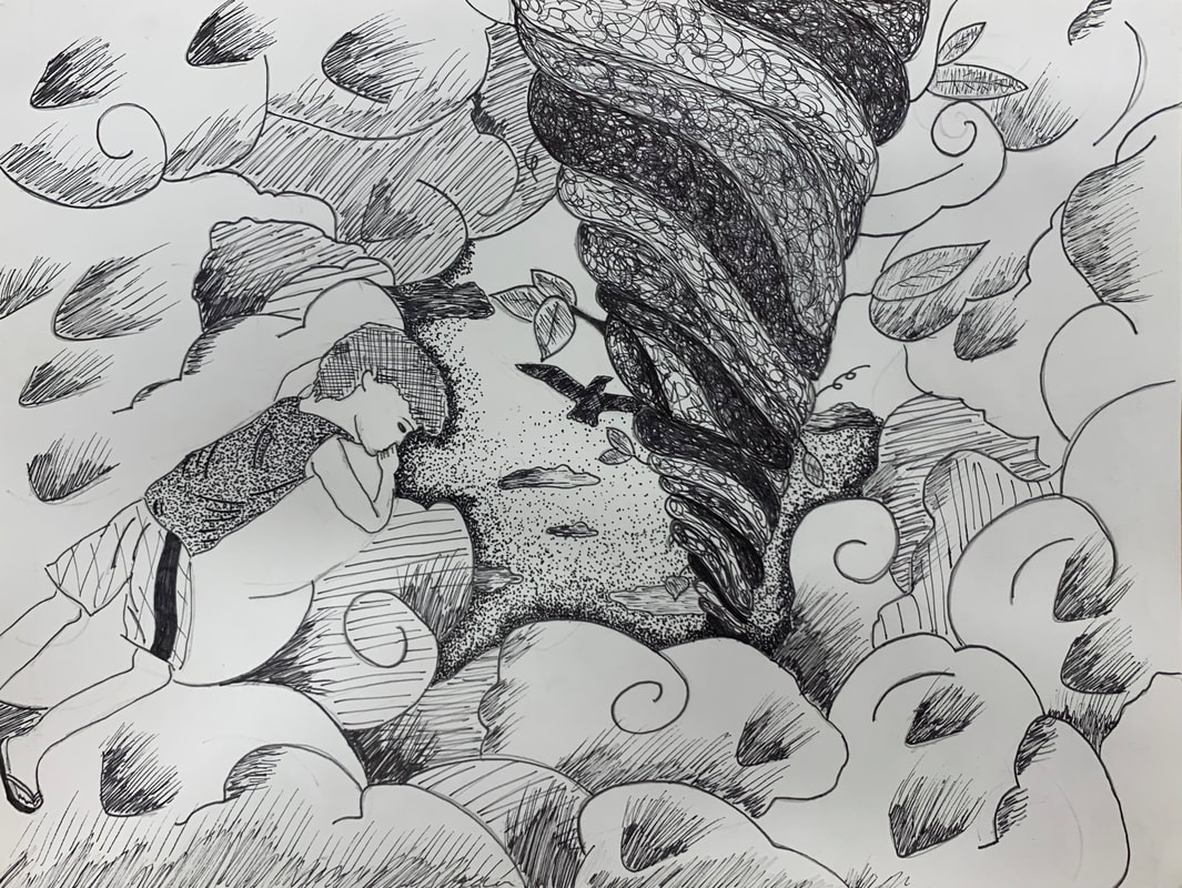 Final Drawing 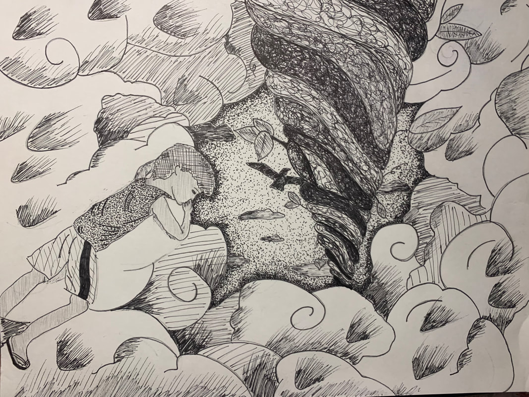 Self Evaluation Questions
1. For the beanstalk, I knew I wanted to do random line because I only wanted to do it once throughout my piece, so the beanstalk would stand out as a focal point more than everything else. I decided to do hatching and cross hatching for the clouds and the boy because it was just to add minor value to those objects. The clouds I wanted to keep majority white, but I wanted to use simple pen techniques to add a little more value and shading to them to still create a realistic look along with shadows. For the sky, I decided to do stippling because I wanted to create a darker look for the sky without it looking black, like the night. So, I decided to create a simple border around the clouds and create that value and function as a hole in the sky. I just used stippling on the boys shirt because I thought it would pop more against the white clouds as another minor effect. 2. I used 1 pt. perspective with the beanstalk. Perspective was important in my piece because it created a realistic impression of depth to my drawing. Without perspective it would just look like a tube going through the clouds and it wouldn't create the same effect with the boy looking down the hole in the clouds towards the earth. 3. Texture is important in my piece because it draws focus towards the main point in my work, meaning the beanstalk and the hole in the clouds. The lack of texture in the clouds creates more of a visual restful look that clouds often bring when you gaze upon them. They don't drown out the main focus of my piece, which is once again, the beanstalk. 4. Value is important in this project because it deals directly with light. Value creates lightness and darkness with a color. Value within this project creates tints and shading to make some objects closer than others. Using a full range of value scale is more aesthetically pleasing and just makes it easier on the eyes to understand what it is you are looking at. 5. I feel my piece is crafted well. It is pretty simplistic, but considering what I was drawing and half of my piece was clouds I think it worked out well. I could have maybe crafted better value within the clouds with more attention to the pen technique I was using. Overall, I thought I drew the beanstalk and the hole in the sky well; I think the different pen techniques mesh well together and create a nice flow and rhythm within my piece. 6. If I could recreate my piece to enhance it more I would probably use less space for the clouds and make the sky bigger. I like the size of the hole in comparison with the rest of my piece now, but some parts I do feel like look a little empty. But, overall I think it worked out well, because once again, majority of my piece was suppose to be clouds in the sky from Jack and the Beanstalk. 7. I represented Jack and the Beanstalk. I represented the story in my own way because I made the boy in my picture look like both my brothers when they were a little younger. But, I also created a more modern look on the boy by putting him in a tank top and gym shorts with scandals, unlike the actual story. 8. It is important to understand the different pen techniques and concepts because understanding of these different skills allows you to grow as an artist, but also grow in terms of creating better representation of different objects within all your artwork. It broadens your skillset as an artist, and can allow for more desired effects within your pieces that you wish to incorporate. 9. I think what I have learned will help guide me in the future in terms of value and cleanliness within my future pieces. Using pen and ink teaches you to focus on different values and shading in itself to create a clean, realistic look to your artwork because, in general, your really only using one color when drawing with pen. Having these skill sets will also just help broaden my knowledge as a growing artist to incorporate styles in the future that speak to me and what mediums I like to use.
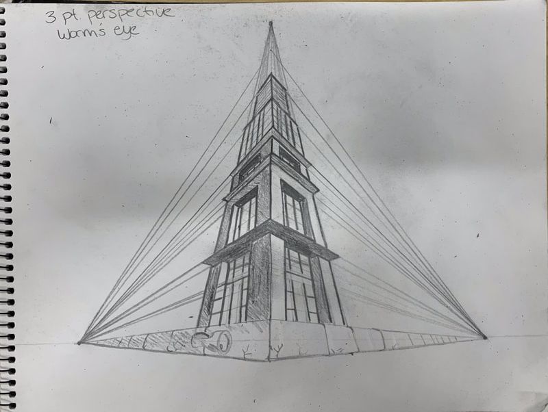
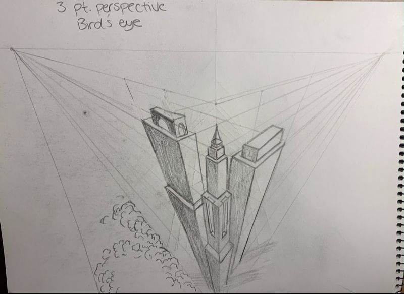
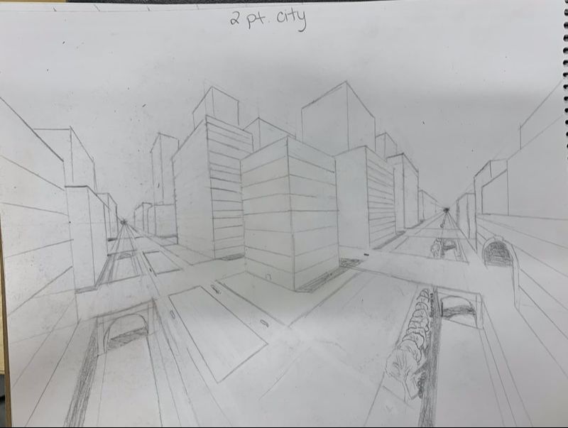 I drew this city in 2 pt. perspective towards the two vanishing points near the edges of the paper on either side. I started with the roads, then I drew all the buildings, then the bridges along with the tunnels. I erased some of the overlapping lines, and then added in details such as the trees, shadows, and lines on the buildings all using a ruler and sketching the lines toward the vanishing points.
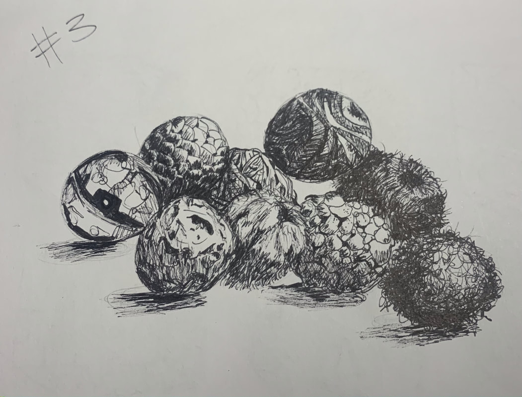
Stippling Shapes 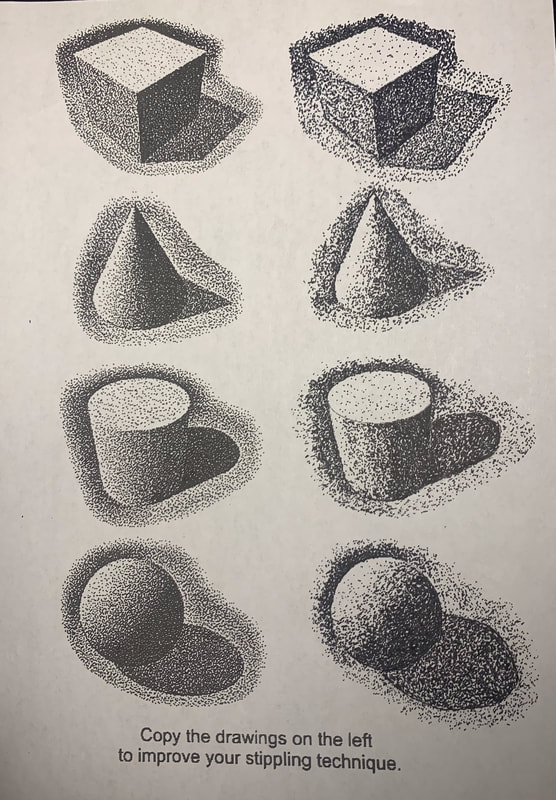 I recreated these four images of shapes using the stippling method in which I focused on creating contrast and shadows and highlights when needed. Value Sheet 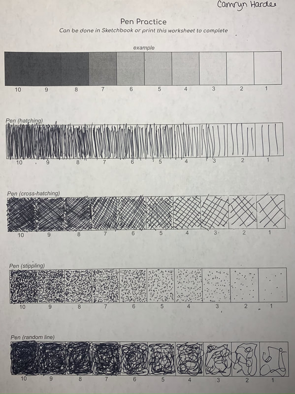 On this sheet I focused on creating different values using the pen using four different methods, hatching, cross-hatching, stippling, and random line. Pen Tutorial Drawings
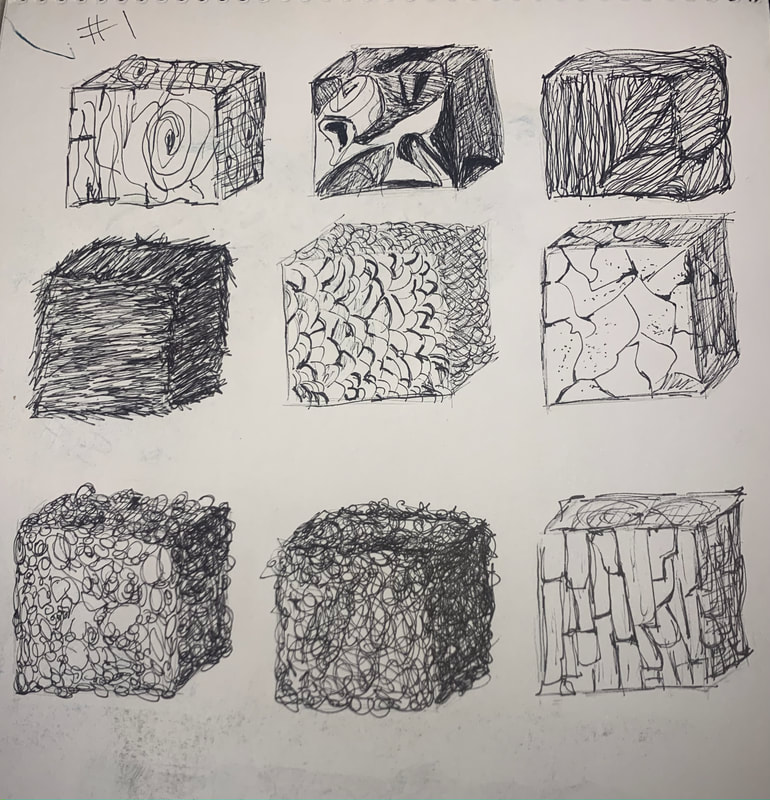
1. I drew nine cubes, then I colored them all while practicing different realistic textures, shading, and highlighting.
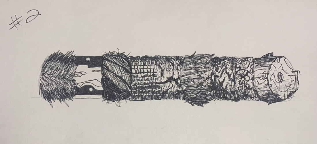
2. I drew a cylinder, divided it into eight different parts, and practiced more realistic drawing textures along with shading and highlighting different areas conformed to a cylinder. 3. Lastly, I drew nine different spheres and then practiced realistic textures and shading and highlighting on parts of a sphere, even working on creating shadows as you can see on the bottom spheres. BrainStorm Ideas |
 |  |
| In Progress Pic #1 | 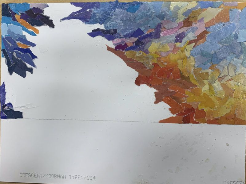 |
 | In Progress Pic #2 |
| In Progress Pic #3 | 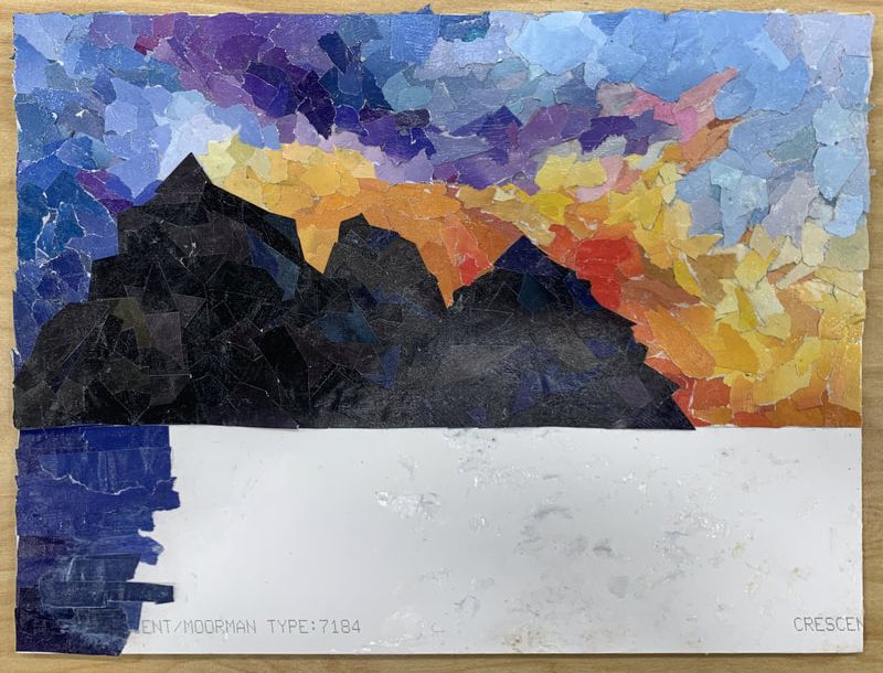 |
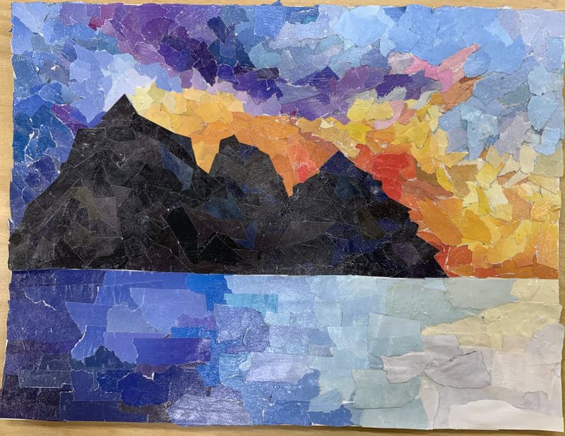
Final Collage
Self Reflection Questions
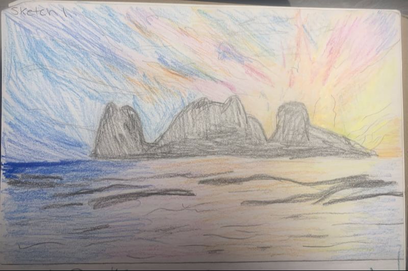
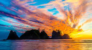
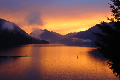
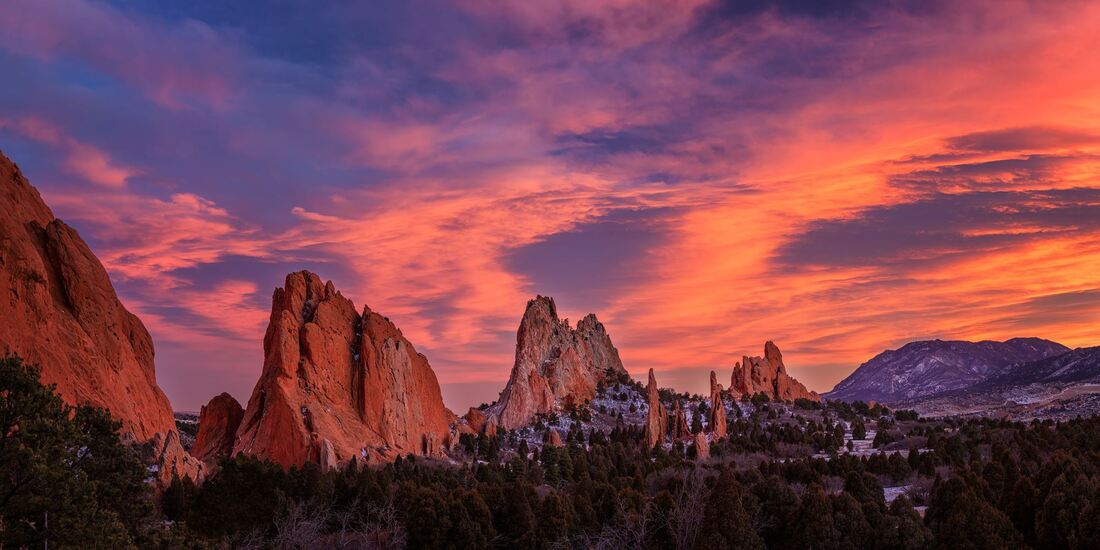
1. I chose this subject matter because I've always wanted to go to Olympic National Park, and I just thought this picture was very pretty. I thought this composition was interesting because of all the colors in the sky and reflecting off the water; it contrasts with the silhouette of the dark mountains. I also thought this composition was interesting because of the movement and rhythm; I felt it really brought the piece together.
2. I think my proportions are slightly off from the actual picture, but I also used a smaller canvas. The mountains in my collage are way more extensive than in the picture, as is the area of the water. The sky doesn't take up as much as the frame, but I think a larger area for the water balances it out. The values, I'd say, are relatively accurate. I think I used a broad range of values for each color, making sure to use darker colors on the left side and lighter shades near where the sun is setting which also helped lead to accurate shading within my piece. I created shadows or darker degrees of light under the mountain reflecting off the water.
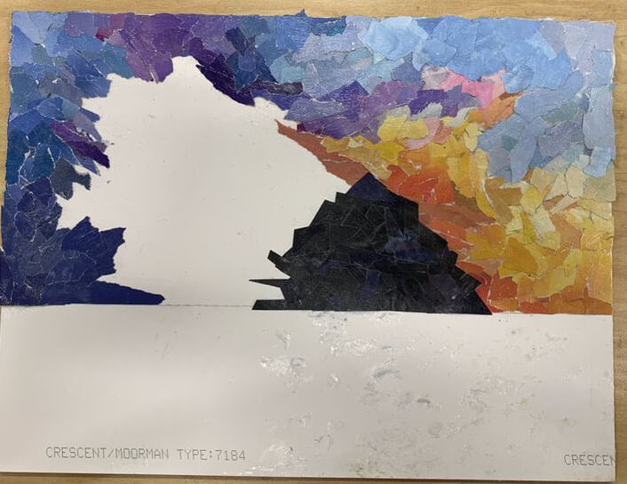
3. I created a visual effect by adding texture, especially in the water. I ripped the pieces and used the white edges without color to visualize waves crashing. Then, I also crumpled some of the pieces in the water to create that look of rushing water and waves to make it look more like water and less like the sky. I also cut out dark pieces for the mountain range instead of ripping them because I wanted to create that smooth, clean look, so the mountains had a little dimension, but not too much.
4. I decided what shapes to use because I wanted to create a messier look for the water and the sky because the sky is messy and it's not one fixed image, so I used ripped pieces. I wanted to use geometric shapes for the mountains because I wanted the mountains to be neat while also creating that jagged, rugged look. I used that same thought process when picking out the different textures. I used thinner sheets to cut for the mountains so it'd be easier to overlap the shapes and create the mountain range to my liking.
5. I feel like I did use a pretty broad range of colors and values in my piece. I used a broad range in the sky and water to ease into darker or lighter parts, such as transitioning from light blue into dark navy blue. I created depth for my foreground and background by overlapping and layering the pieces everywhere. I also used smaller pieces of paper for the sky to make it feel like you are viewing the actual background of the mountain range. I then used larger pieces for the water to create that closer look in front of the mountain range.
6. I feel like I executed the sky well and used different shades to gently ease the next color rather than create a sharp contrast. I feel the mountains were executed well by placing different dark colors in spots to create areas of depth and highlight. I feel the water isn't as neat as the rest of the piece, but I feel like it fits because water isn't necessarily always calm and pretty looking. Especially in the ocean, I think the messiness adds more to crashing waves and rushing water.
7. I would improve my artwork if I were to redo it by finding better color shades ahead of time that would gently blend. I feel like I struggled half the time by not cutting out enough pieces and spending half of my time looking for shades that would work; I felt like I was always looking for light yellow hues. I would also sketch out where I wanted specific colors before gluing them down to have more of a set plan of action.
1. I chose this subject matter because I've always wanted to go to Olympic National Park, and I just thought this picture was very pretty. I thought this composition was interesting because of all the colors in the sky and reflecting off the water; it contrasts with the silhouette of the dark mountains. I also thought this composition was interesting because of the movement and rhythm; I felt it really brought the piece together.
2. I think my proportions are slightly off from the actual picture, but I also used a smaller canvas. The mountains in my collage are way more extensive than in the picture, as is the area of the water. The sky doesn't take up as much as the frame, but I think a larger area for the water balances it out. The values, I'd say, are relatively accurate. I think I used a broad range of values for each color, making sure to use darker colors on the left side and lighter shades near where the sun is setting which also helped lead to accurate shading within my piece. I created shadows or darker degrees of light under the mountain reflecting off the water.
3. I created a visual effect by adding texture, especially in the water. I ripped the pieces and used the white edges without color to visualize waves crashing. Then, I also crumpled some of the pieces in the water to create that look of rushing water and waves to make it look more like water and less like the sky. I also cut out dark pieces for the mountain range instead of ripping them because I wanted to create that smooth, clean look, so the mountains had a little dimension, but not too much.
4. I decided what shapes to use because I wanted to create a messier look for the water and the sky because the sky is messy and it's not one fixed image, so I used ripped pieces. I wanted to use geometric shapes for the mountains because I wanted the mountains to be neat while also creating that jagged, rugged look. I used that same thought process when picking out the different textures. I used thinner sheets to cut for the mountains so it'd be easier to overlap the shapes and create the mountain range to my liking.
5. I feel like I did use a pretty broad range of colors and values in my piece. I used a broad range in the sky and water to ease into darker or lighter parts, such as transitioning from light blue into dark navy blue. I created depth for my foreground and background by overlapping and layering the pieces everywhere. I also used smaller pieces of paper for the sky to make it feel like you are viewing the actual background of the mountain range. I then used larger pieces for the water to create that closer look in front of the mountain range.
6. I feel like I executed the sky well and used different shades to gently ease the next color rather than create a sharp contrast. I feel the mountains were executed well by placing different dark colors in spots to create areas of depth and highlight. I feel the water isn't as neat as the rest of the piece, but I feel like it fits because water isn't necessarily always calm and pretty looking. Especially in the ocean, I think the messiness adds more to crashing waves and rushing water.
7. I would improve my artwork if I were to redo it by finding better color shades ahead of time that would gently blend. I feel like I struggled half the time by not cutting out enough pieces and spending half of my time looking for shades that would work; I felt like I was always looking for light yellow hues. I would also sketch out where I wanted specific colors before gluing them down to have more of a set plan of action.
Author
Write something about yourself. No need to be fancy, just an overview.
Archives
June 2022
May 2022
April 2022
March 2022
February 2022
January 2022
 RSS Feed
