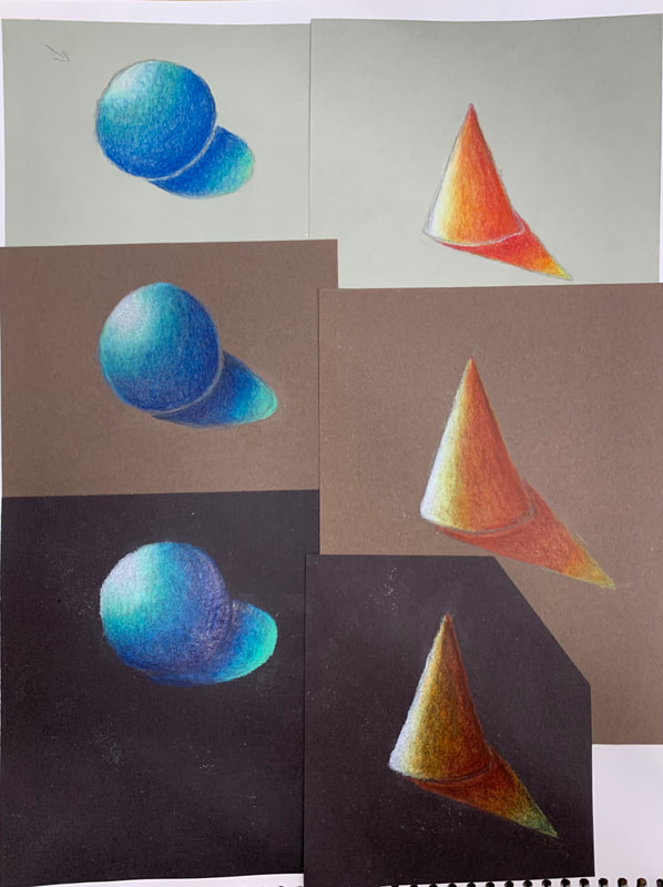
 On each colored paper, I drew a sphere and a cone. For each shape, I identified a light source and a cast shadow and I picked a light, medium, and dark color to shade in my shape with the proper shadows and highlights. My light colors were mint and yellow, my medium colors were light blue and orange, and my dark colors were dark blue and red.
0 Comments
Brainstorming Ideas
Sketches 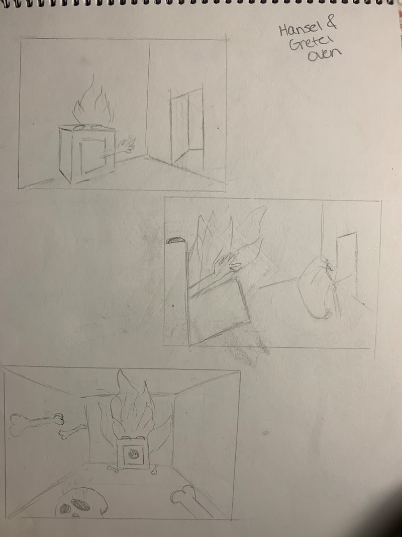 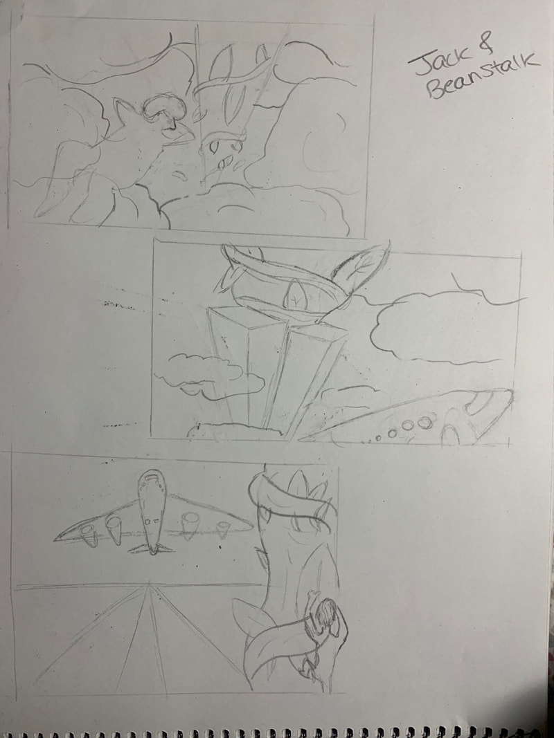 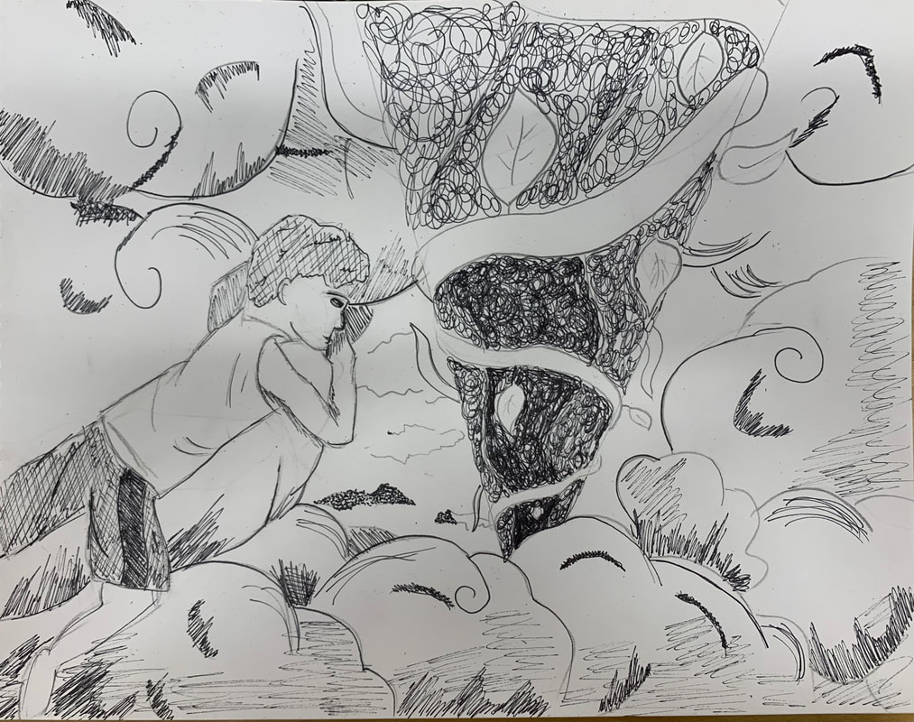 In Progress PIctures 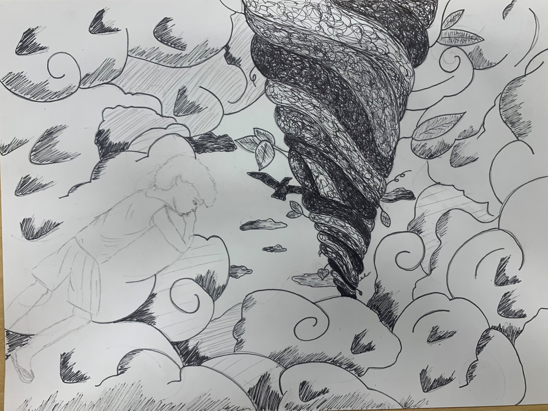 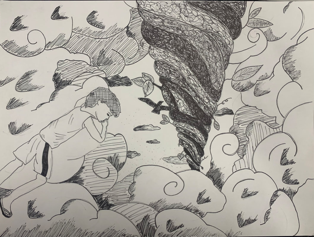 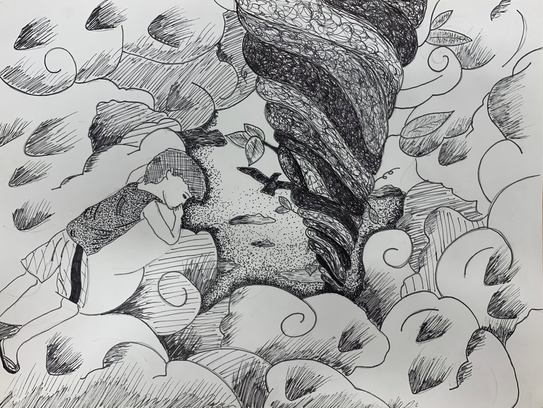 Final Drawing 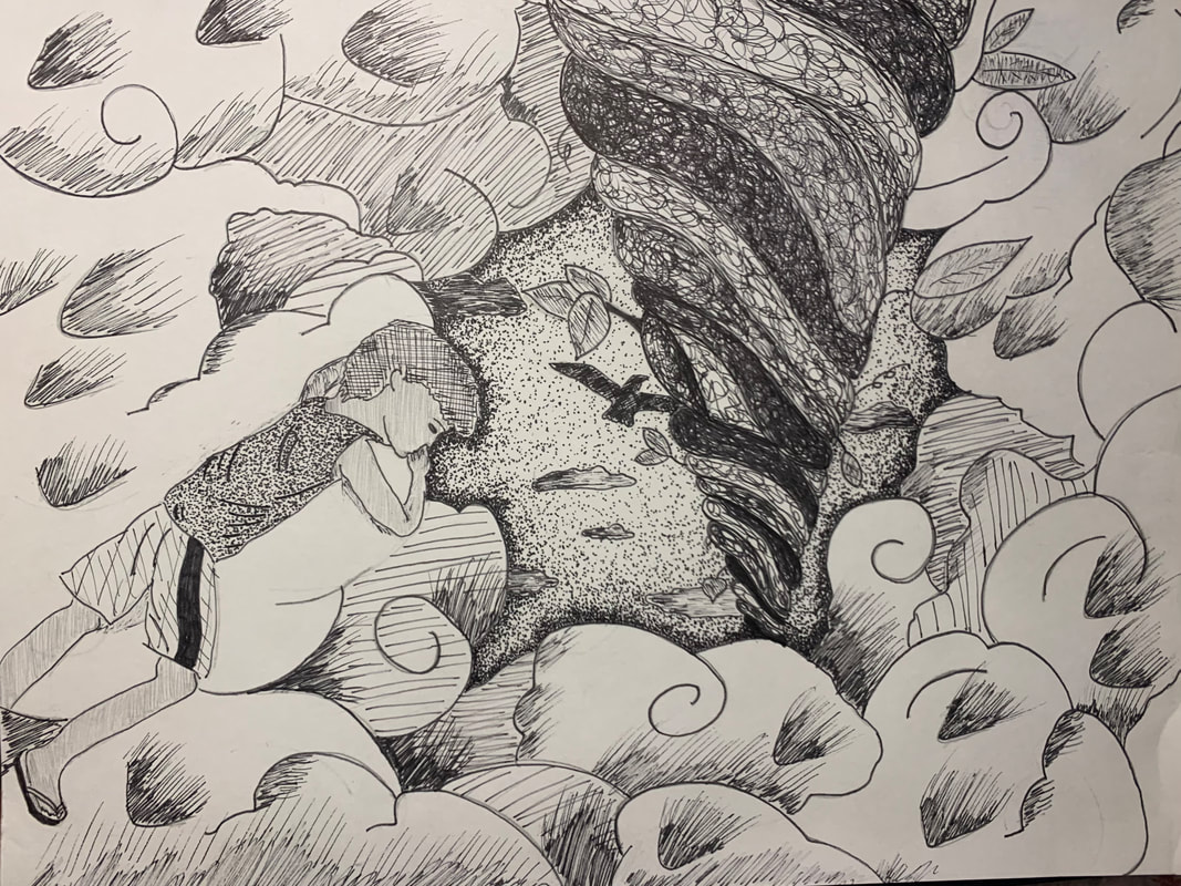 Self Evaluation Questions
1. For the beanstalk, I knew I wanted to do random line because I only wanted to do it once throughout my piece, so the beanstalk would stand out as a focal point more than everything else. I decided to do hatching and cross hatching for the clouds and the boy because it was just to add minor value to those objects. The clouds I wanted to keep majority white, but I wanted to use simple pen techniques to add a little more value and shading to them to still create a realistic look along with shadows. For the sky, I decided to do stippling because I wanted to create a darker look for the sky without it looking black, like the night. So, I decided to create a simple border around the clouds and create that value and function as a hole in the sky. I just used stippling on the boys shirt because I thought it would pop more against the white clouds as another minor effect. 2. I used 1 pt. perspective with the beanstalk. Perspective was important in my piece because it created a realistic impression of depth to my drawing. Without perspective it would just look like a tube going through the clouds and it wouldn't create the same effect with the boy looking down the hole in the clouds towards the earth. 3. Texture is important in my piece because it draws focus towards the main point in my work, meaning the beanstalk and the hole in the clouds. The lack of texture in the clouds creates more of a visual restful look that clouds often bring when you gaze upon them. They don't drown out the main focus of my piece, which is once again, the beanstalk. 4. Value is important in this project because it deals directly with light. Value creates lightness and darkness with a color. Value within this project creates tints and shading to make some objects closer than others. Using a full range of value scale is more aesthetically pleasing and just makes it easier on the eyes to understand what it is you are looking at. 5. I feel my piece is crafted well. It is pretty simplistic, but considering what I was drawing and half of my piece was clouds I think it worked out well. I could have maybe crafted better value within the clouds with more attention to the pen technique I was using. Overall, I thought I drew the beanstalk and the hole in the sky well; I think the different pen techniques mesh well together and create a nice flow and rhythm within my piece. 6. If I could recreate my piece to enhance it more I would probably use less space for the clouds and make the sky bigger. I like the size of the hole in comparison with the rest of my piece now, but some parts I do feel like look a little empty. But, overall I think it worked out well, because once again, majority of my piece was suppose to be clouds in the sky from Jack and the Beanstalk. 7. I represented Jack and the Beanstalk. I represented the story in my own way because I made the boy in my picture look like both my brothers when they were a little younger. But, I also created a more modern look on the boy by putting him in a tank top and gym shorts with scandals, unlike the actual story. 8. It is important to understand the different pen techniques and concepts because understanding of these different skills allows you to grow as an artist, but also grow in terms of creating better representation of different objects within all your artwork. It broadens your skillset as an artist, and can allow for more desired effects within your pieces that you wish to incorporate. 9. I think what I have learned will help guide me in the future in terms of value and cleanliness within my future pieces. Using pen and ink teaches you to focus on different values and shading in itself to create a clean, realistic look to your artwork because, in general, your really only using one color when drawing with pen. Having these skill sets will also just help broaden my knowledge as a growing artist to incorporate styles in the future that speak to me and what mediums I like to use.
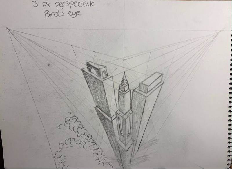
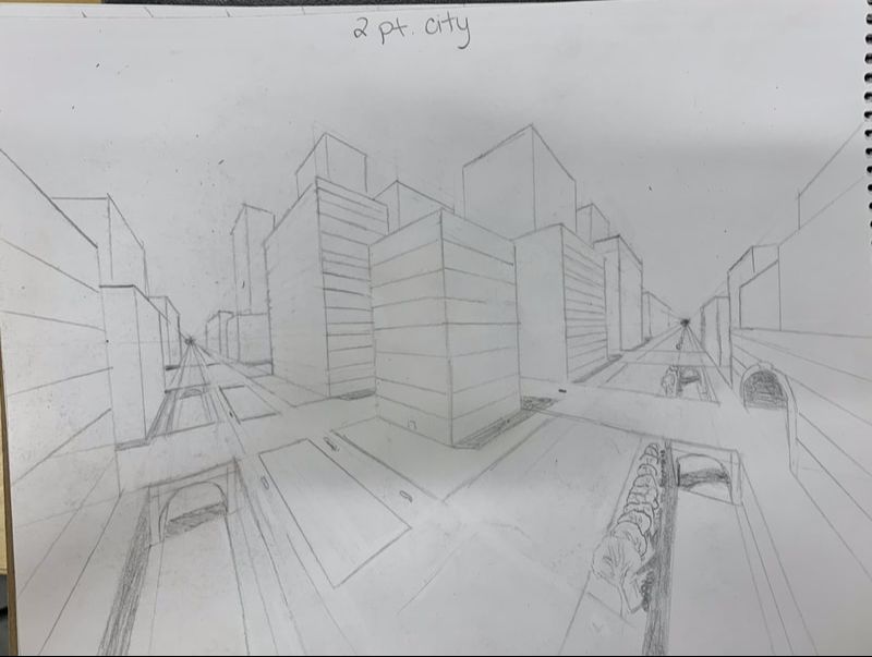 I drew this city in 2 pt. perspective towards the two vanishing points near the edges of the paper on either side. I started with the roads, then I drew all the buildings, then the bridges along with the tunnels. I erased some of the overlapping lines, and then added in details such as the trees, shadows, and lines on the buildings all using a ruler and sketching the lines toward the vanishing points.
|
AuthorWrite something about yourself. No need to be fancy, just an overview. Archives
June 2022
Categories |
 RSS Feed
